


Photo composition refers to the arrangement of subjects or elements within the frame of a photograph. The way you select and arrange these subjects can significantly impact the quality of your photo. By determining the focal point of interest and strategically placing it within the frame, you can effectively capture the viewer’s attention. Ultimately, the ultimate goal of photography is to create visually pleasing images that resonate with the audience.
While there exist certain rules and guidelines to assist in improving photo composition, it’s important to note that they are not set in stone and should not be followed rigidly. Nevertheless, many of these principles have been employed in the art of photography for centuries and have proven to enhance the overall aesthetic appeal of compositions.
The following are some guidelines and rules that I found more interesting and worth consideration when composing your photo:
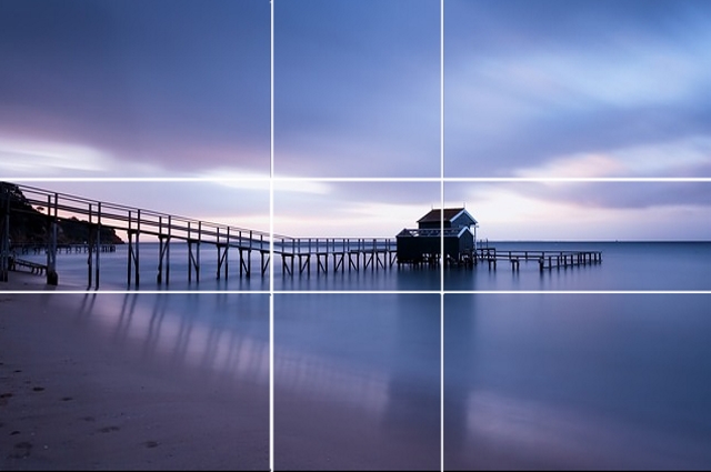
Rule 1: The rule of third
Probably it is the most well-known composition technique; the rule of thirds is very simple. You divide the frame into 9 equal rectangles, 3 across and 3 down as illustrated below.
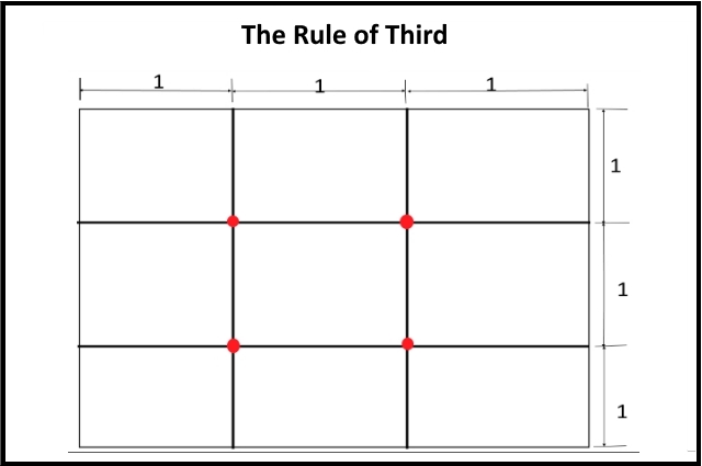
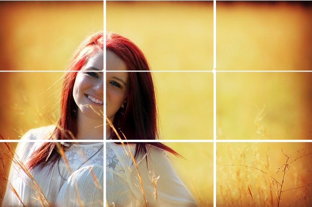
The idea is to place the important element(s) of the scene along one or more of the lines or where the lines intersect. In the below photo, the face of the girl is placed where the lines are intersected.
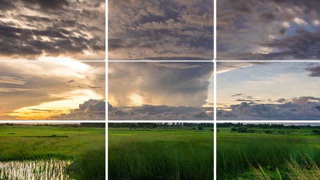
In the below photo, I place the horizon along the bottom horizontal line and centered the lower ends of the cloud in the middle rectangle.
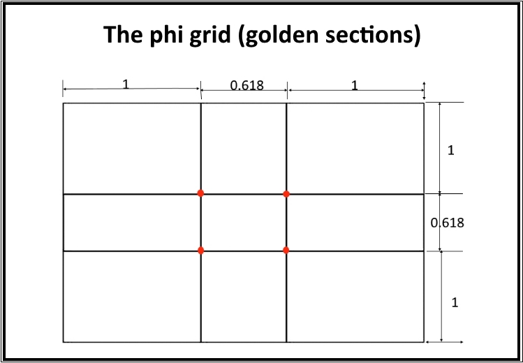
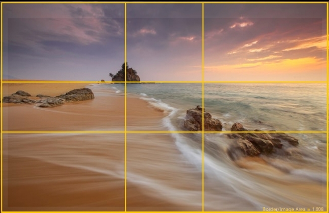
Rule 2: The Phi grid (golden sections)
The golden ratio is also used as a basis for a well-composed photograph. The Golden Section Rule states that the eye is naturally drawn the points that lie within this ratio in a photograph. In order to achieve this, the picture is divided into 9 unequal but symmetrical parts with 2 horizontal lines and 2 vertical lines as a guide. The distances between both vertical lines and horizontal lines followed the golden ratio of 1: 1.618 as shown by the following chart:
Placing your subject along any of these lines, especially on the intersections, makes it more naturally attractive to the viewer. These intersections are sometimes called PowerPoints. In the below photo, the hut is placed near the right two power points to make the photograph more pleasing to look at.
For landscapes, the horizon is aligned to any of the horizontal lines depending on which part is the focus of the photograph. If you want to capture the sky, align the horizon to the lower horizontal line. If you want to show the field or the sea, then align the horizon on the upper horizontal line.
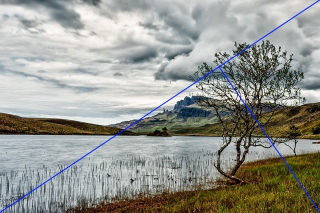
Rule 3: The golden triangle
This rule is useful if the scene is composed of many diagonal lines. It also uses the golden ratio principles. The grid of the golden triangle is shown below:
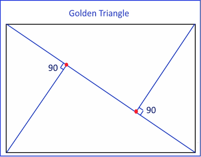
As with the rule of thirds, we use the lines (of the triangles in this case) to help us position the various elements in the scene. Also positioning your subject on any of the intersections will make your photograph aesthetically pleasing. The alignment doesn’t have to be precise and the elements in your scene don’t have to be straight, just enough that it is distinguishable. The following photos illustrate the concept:
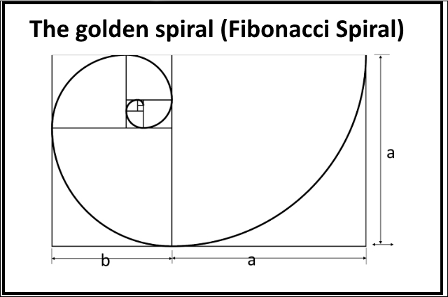
Rule 4: The golden spiral (Fibonacci Spiral)
Another practical use of the Golden Ratio is the Golden Spiral Rule. With this rule, The Fibonacci Spiral is created from a series of squares using Fibonacci’s numbers, with the length of each square being a Fibonacci number. A series of diagonal points on each square will then create a path for which the spiral can flow through the frame. The point where the smallest rectangle lies is the “PowerPoint” where the subject should be positioned. Following the direction where the resulting rectangles are positioned, a spiral may be drawn connecting the outer corners and this line is used as a guide for the rest of the objects in the scene as shown in the below overlay.
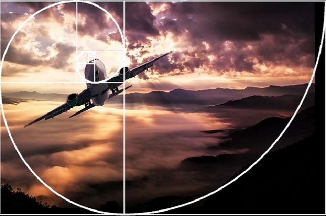
Using the spiral as a tool to compose a photograph will allow the viewer to be led around the image in a natural flow. In the below photo the airplane is positioned at the ends of the spiral, where the power point is.
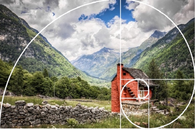
Another example, the spiral leads us to the door of the hut.
Rule 5: Rule of symmetry (centered composition)
There are times when placing a subject in the center of the frame, it works really well. Symmetrical scenes are perfect for a centered composition. This rule works great when shooting a scene and its reflection in the water, for example, positioning the line of symmetry (both horizontal and vertical symmetry) in the middle of the frame it works really great.


Rule 6: color composition
Colors can attract and draw attention, they can be combined together to create an effective composition. The photo below shows the primary colors (they can’t be created by mixing other colors) and the secondary colors (colors that are created by mixing two primary ones).
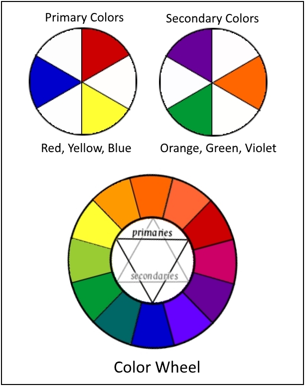
Also, it shows that for each color there is an opposite color. This pair of colors is known as complementary colors. For example, Violet is opposite to yellow. Thus, violet and yellow are complementary colors.
Color harmony is achieved when you are able to successfully look for and combine pairs of complementary colors in your composition.


Rule 7: leading line composition
Anything from paths, walls or patterns can be used as leading lines. Leading lines can help guide the viewer through the image and focus attention on important elements (main subject).

In this photo of the Eiffel Tower, the roads and the central pole work as leading lines. The lines on the ground all lead the viewer to the Eiffel Tower in the distance. You’ll also notice that I used a centered composition for this scene. The symmetry of the surroundings made this type of composition work well.
Leading lines do not necessarily have to be straight as illustrated by the picture above. In fact, curved lines can be very attractive compositional features.

Rule 8: Separation of the subject
This is a particularly useful technique for shooting portraits, macro, and close-up photography. Using a shallow depth of field to isolate your subject is a very effective way of simplifying your composition and get more attention on the main subject. You can learn more about how to control your depth of field in my tutorial “How to Control DOF of Your Photos – Shallow Depth of Field vs Deep Depth of Field”
The photos below show how the using of shallow depth of field is a strong composition tool to emphasize the subject.


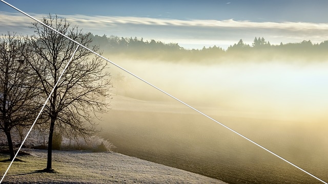
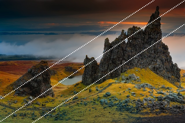
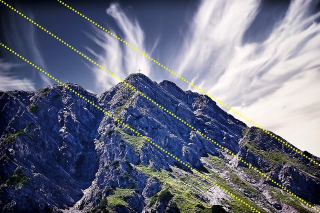
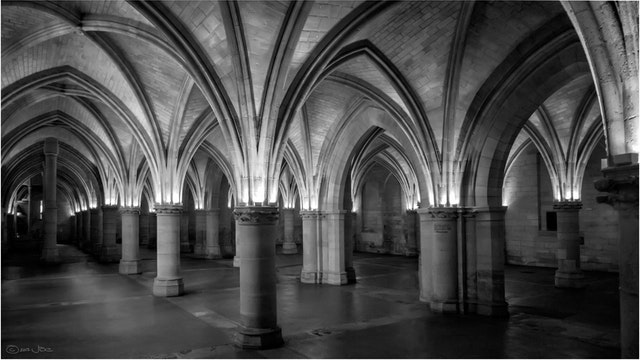
Rule 9: the diagonals rule
The Diagonal Rule states that a photograph looks more dynamic if the objects fall or follow a diagonal line. The diagonal line doesn’t have to be an actual line and it doesn’t have to be a straight one. It could be the edges of a river, the top of a forest, or even an imaginary line connecting the different objects in the scene.
The diagonal grid looks like the below chart:
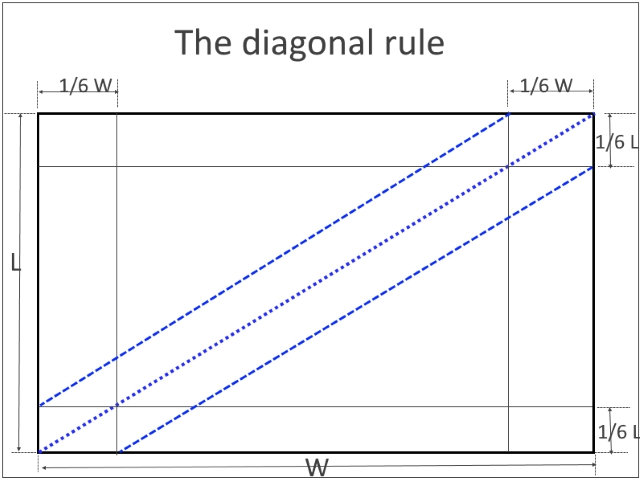
By placing natural elements that form a line along these diagonal guides makes the picture more pleasing and dynamic.
Rule 10: Pattern rule
Patterns are visually attractive and suggest harmony, and human beings are naturally attracted to them. Incorporating patterns into your photographs is always a good way to create a pleasing composition.

Conclusion:
I think that implementing all the above-mentioned rules is very hard, and remembering them is nearly impossible. However, a good experience is to make an effort to use one or two of them each time you go out. After a while, you will begin to use them naturally without having to think about them.
Related posts
Golden Ratio and Photography Composition
Top 10 Photography Rules – Guidelines for better photos
Rule Of Symmetry In Photography
Thanks for reading the article, hope you found it useful. If you have any questions or comments, just leave it in the below box. I’ll be glad to answer as soon as possible.
Remember to subscribe to the site, we will notify you only if a new article is posted.


Wonderful page, I love how you present it, photography courses are very explicit and easy to understand. I am a lover of art and everything that shows beauty and I am passionate about good taste. I don’t have much knowledge of the techniques of photography, so I can tell you that your information is very interesting for my
Thanks Olga for your comment.