A common uncertainty that some photographers face when starting to edit their photos is the difference between vibrance and saturation. In fact, both saturation and vibrance work to increase or decrease the intensity of the colors in an image; however, they do so in significantly different ways.
While you have probably noticed these differences during your editing process, you may not know exactly the reason why these seemingly identical tools provide such different results.
In this tutorial, we will explain the main differences between vibrance vs saturation in photography, and how to choose which one to use. First, let us begin by explaining some related terms and definitions.
What is color?
Color is the visual byproduct of the spectrum of light as it is either transmitted through a transparent medium or as it is absorbed and reflected off a surface. Color is the light wavelengths that the human eye receives and processes from a reflected source.
Color consists of three main integral parts:
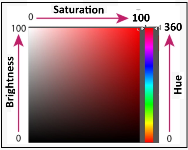
- Hue
Hue is the dominant wavelength and is the first item we refer to (i.e. “yellow”) when adding in the three components of a color.
The color is reflected from or transmitted through an object. It is measured as a location on the standard color wheel, expressed as a degree between 0 and 360. In common use, hue is identified by the name of the color, such as red, orange, or green.
- Saturation
Saturation defines the brilliance and intensity of a color, i.e. the strength or purity of the color. It is sometimes called chroma, It represents the amount of gray in proportion to the hue, measured as a percentage from 0 (gray) to 100 (fully saturated).
- Brightness
Brightness value refers to the lightness or darkness of a color, usually measured as a percentage from 0 (black) to 100 (white). It indicates the quantity of light reflected. When referring to pigments, dark values with black added are called “shades” of the given hue name. Light values with white pigment added are called “tints” of the hue name.
Color modes:
The color mode or image mode determines how colors combine based on the number of channels in a color model. Different color modes result in different levels of color detail and file size. For instance, use CMYK color mode for images in a full-color print brochure, and use RGB color mode for images on the web or e-mail to reduce file size while maintaining color integrity.
When using the color picker tool in editing software, you will notice that the color values are shown in the following different modes.
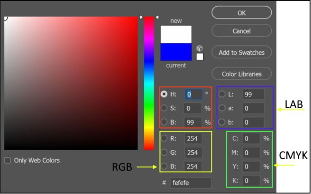
-
HSB Color mode
The human eye perceives color in terms of three characteristics, hue, saturation, and brightness (HSB). Regardless of the hue (color) value, the white color has a brightness of 100 and a saturation of 0, while the black color has a 0 brightness and a saturation of 0.
-
RGB Color mode
RGB images use three colors, or channels, to reproduce colors on screen (red, green, blue), the intensity values range from 0 (black) to 255 (white) for each of the RGB components When the values of all three components are equal, the result is a shade of neutral gray. When the values of all components are 255, the result is pure white; when the values are 0, pure black.
-
CMYK Color mode
In the CMYK mode, each pixel is assigned a percentage value for each of the four colors (Cyan, Magenta, Yellow, and black). In CMYK images, pure white is generated when all four components have values of 0%.
-
Lab Color mode
Lab Color is a more accurate color space. It uses three values (L, a, and b) to specify colors. RGB and CMYK color spaces specify a color by telling a device how much of each color is needed. Lab Color works more like the human eye.
It specifies a color using a 3-axis system. The a-axis (green to red), b-axis (blue to yellow), and Lightness axis.
What is saturation in photography?
Saturation is actually a description of how intense or dull the light of a specific frequency or wavelength is coming from a light source. This is actually why the color of an object changes as its light source changes, despite the object always having the same color.
In photography, saturation refers to how pure a color is. How red is the red? How blue is the blue? You can imagine color being “absorbed” in the photograph like a sponge, with a higher saturation resulting in a more significant color.
A saturated red will be deep and true, while a desaturated red will be quite gray and dull.
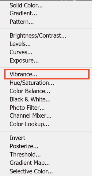
In Photoshop, You may add a vibrance-adjusting layer
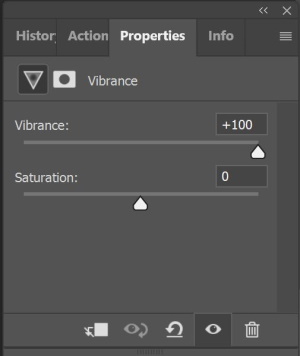
Then use the saturation slider to increase or decrease the saturation. When dragging the slider towards the right colors is brightened and deepened. While pulling it to the left removes the colors and ultimately makes it a monochrome.
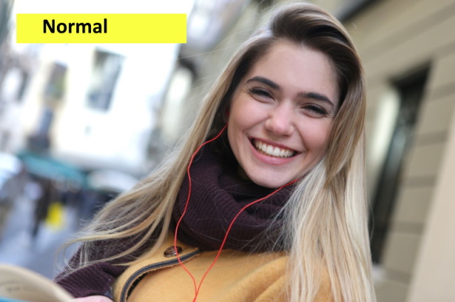
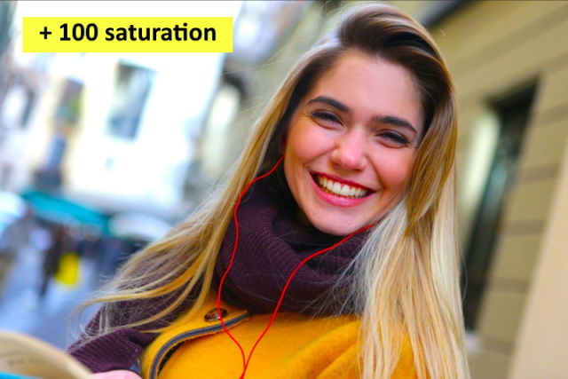
The following photos show the effect of increasing and decreasing saturation.
The normal photo by Andrea Piacquadio from Pexels
The below photo is edited with +100 saturation
The below photo is edited with -100 saturation
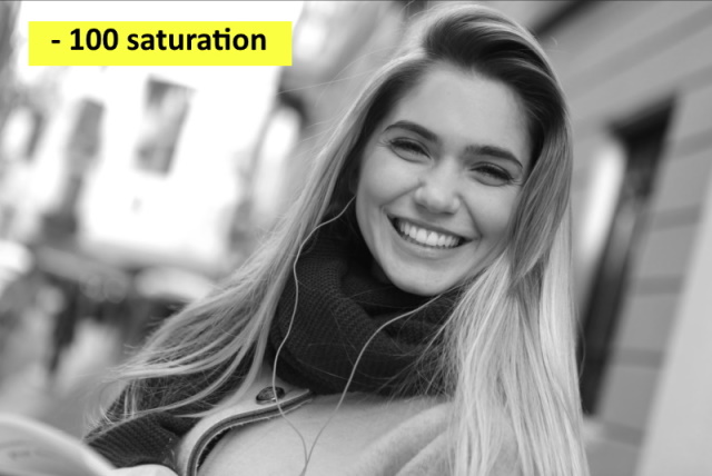
It is clear from the above photos that saturation adjusts all the pixels in an image. That means that pixels with an already high saturation are treated equally as pixels with low saturation.
The problem with this is that you’ll end up clipping the already saturated colors and losing details in them.
What is vibrance in photography?
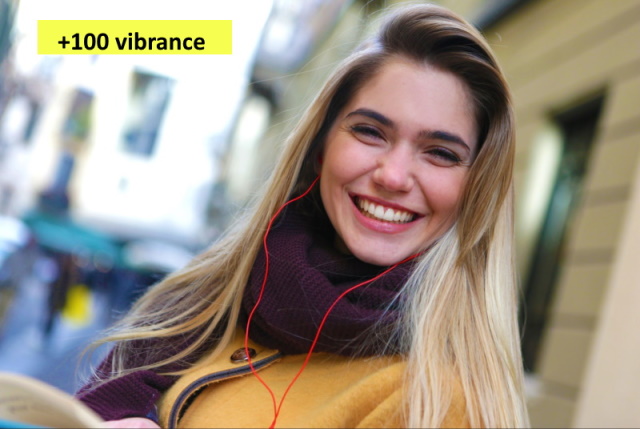
The concept of vibrance was invented by Adobe after they developed a smart tool for more precise color editing on their software. It allows photographers to increase the intensity of muted and less saturated colors while leaving saturated colors untouched. As a result, images appear much more natural and even.
The below photo is edited using vibrance value of +100
The below photo is edited using a vibrance value of -100
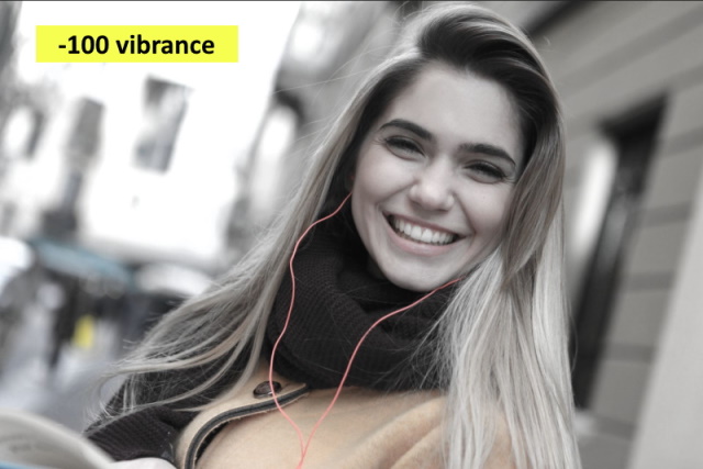
It is clear from the above photos that vibrance adjusts the saturation of the pixels in the image in a smarter way. That means that pixels with an already high saturation are treated differently than pixels with low saturation.
Differences between saturation and vibrance
The following points summarize the differences between Vibrance and saturation:
- A saturation slider can be used for still-life photographs and landscapes, as there is less likelihood that adjusting all of the colors at the same time, in the same way, will make an image look too artificial. For images that involve people or natural colors, saturation can very quickly make skin tone look unnatural.
- This statement is said by Adobe: “Vibrance adjusts the saturation so that clipping is minimized as colors approach full saturation. This adjustment increases the saturation of less-saturated colors more than the colors that are already saturated. Vibrance also prevents skin tones from becoming oversaturated”.
- Vibrance only affects the less saturated colors of an image; colors and pixels that already are saturated are less affected, which means that it’s less likely to blow out any colors, and prevents colors from becoming overly saturated. This is especially important when working in fields such as fashion or portrait photography, as skin tones can easily appear unnatural as saturation is increased.
- A desaturated image will only show gray tones, which leads to monochrome photos.
- Decreasing vibrance affects only certain colors in the image, and thus the result does display muted tones.
Photo by Rosemary Ketchum from Pexels
Conclusion
Saturation and Vibrance are important parts of a photographer’s post-processing workflow. After all, they can make an image more vibrant and welcoming.
The main difference is that Saturation affects all pixels while Vibrance only adjusts the less dominant colors. Besides that, they are similar and are used for the same purpose.
When you edit photos, you should consider that each adjustment you make could affect other parameters of the photo. For example, if you lower your color saturation or vibrance and then increase the contrast, you’ll notice that the colors become vibrant and intense again. Likewise, if you increase saturation or vibrance and then darken the image, the colors become muted again.
If you are interested in reading more about post-processing tips and tricks, you may check our photography editing articles.
Thanks for reading, I hope you enjoyed the article, in case you have any questions just drop them below & I will be happy to answer you.
The featured Photo by Lisa from Pexels
If you enjoy the site, don’t forget to subscribe, we will only inform you when a new article is posted.




I’ve got a lot of friends and family that I know for a fact will appreciate this post. The majority of them are photographers who want to learn something new so this article is something that they will appreciate. I will be sure to refer them to this article as it is very informative. Thank you for this
Thanks!
Hey,
I think I will have to convert to photography after all. Your articles are so beautifully written and well explained! This is already my fourth review (I think) and it still surprises me how you can explain this so expertly!
I’m already happy to be able to work a little with “PhotoPad” on my MacBook Air. And as with everything, one learns by doing. But you are more sure of success if you can get such good help like these various articles from your hand.
Very knowledgeable!
With best regards,
I really appreciate your comment, thanks! and best regards