


Designing a photography logo has its share of challenges, just like there are in creating any other kind of logo. You need to understand the fundamentals of logo design to start with. Then you also need to review some logo design ideas online and find the perfect tool for the job. If you have some experience in graphics design, then you can use a full-fledged graphics editing program such as Adobe Photoshop. It is also important to look at the popular snappy photography logos to inspire your design,
What makes a good photography logo?
It doesn’t matter what kind of photography business you run- selling photos online, wedding photography services, photography blog, etc. you need a business logo in all cases. This is because there the competition in the photography business is higher than ever, and you need a brand (of which the logo is an essential part) to stand out. This brings us to the obvious question- what makes a good photography logo? The answer is- a mix of different things.
A good photography logo is attractive, unique, and memorable. But even more than that, it resonates with your target demographic. It uses the right colors, fonts, and other visual elements. It also tells your business story and the values that you stand for.
There are various ways to brainstorm a photography logo. One of these is to study other popular logos to get the logo design ideas flowing. So, let’s take a look at the photography industry with these 13 amazing photography logos:
1) Canon
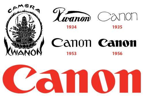
Canon has a wordmark logo, which means the logo comprises just the brand’s name. However, the typography used by the brand is unique and attractive which has made the logo memorable.
The Canon logo was originally introduced in the year 1935. Since then, it’s gone through a few revisions. However, what’s stayed consistent with the logo is the inward stroke of the C.
2) Kodak
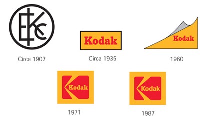
Kotak’s first logo was introduced in 1907, although the earliest version of the logo most of us are familiar with was introduced in 1935. The latest logo uses two colors- orange and red (representing love, happiness, and passion) and attractive font for the brand. It also cleverly contains the graphic element “K” within the logo box.
3) Nikon
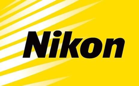
Nikon is another well-known company in the photography industry. It has some of the best products for imaging and optics that people across the globe use. The company’s logo has a bright yellow background with white strikes that represent energy and the company’s motto of meeting customer expectations. The yellow color represents trust and commitment. The typeface is also custom which fits the company’s brand image perfectly.
4) Fujifilm
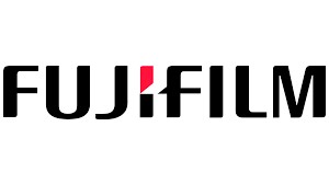
Fujifilm is a well-established Japanese brand in the photo equipment industry. The brand’s logo has gone through many changes since its inception which was in 1934. The current logo which was originally introduced in 2006 has the brand name separated by a white triangle. There is a red accent in the letter “I” and the rest of the typeface is colored black. Other than this version, two other variants are used. In one of these, there is a green background and white and red lettering. In the other one, the entire logo is in monochrome.
5) Sony
![]()
The origin of Sony is the Latin word Sonus’ derivative which means sound. The words sonny and sunny were also inspirations for the brand name. The typeface was chosen to signify simplicity and strength. The color black was chosen to represent excellence and elegance. The font used is a modification of Clarendon typeface.
6) Shutterstock

Shutterstock is one of the biggest stock photo websites. Naturally, the company’s logo is apt to justify the brand’s widespread presence. It’s a wordmark logo with a visual effect on the letter O. The company calls this alphabet “the viewfinder” which represents how the company showcases its vast selection of HD photos and videos. This viewfinder also symbolizes the creative freedom that the contributors have when they take artistic shots and videos behind the lens.
7) GoPro

GoPro’s logo contains a black background and the brand name in the middle. There are four squares with different colors under the name. The left-most circle represents sports such as skiing, motocross, and other terrestrial sports. The next square (light blue) represents water sports such as wakeboarding, windsurfing, etc. as it’s the color of surf. The next circle with the darkest blue of all represents diving. The last square which has white color symbolizes snow or winter sports. A tagline also accompanies the logo sometimes and it’s “Be a HERO”.
8) Instagram

Instagram’s icon is the main component of the brand’s visual identity and it hasn’t changed much since it was introduced in 2010. The original icon was a brown camera but the company realized that it wasn’t enough to represent the entire brand. So, they decided to infuse multiple bright colors in the icon to truly represent the brand’s openness to the millennials and the new-age creators.
In 2016, the company introduces the new logo and it’s used till today. It has a bright gradient square background and thick lines in the middle. It’s simple but highly memorable.
Other than these, some additional well-known logos are displayed below.
9) Panasonic
Panasonic logo is a wordmark logo. The font is based on Helvetica typeface and the blue color represents the bright future and the consistent performance of the brand.
10) Leica
Leica logo is the perfect example of how to use negative space. They have used the brand name in the red background as a negative space. The red and white colors used are also perfect as they reflect the love and passion for photography.
11) Olympus

This logo is also called the Olympus Communication Symbol by the company. The design was carefully put together to convey a message of top-quality and refinement.
12) Minolta
The Minolta logo was introduced in 1981 and it contains a circle that represents the globe. The five white lines on the circle represent the company’s extensive technological reach in the domain of imaging. The color blue used here represents creative innovation and the company calls it the Konica Minolta Blue. The typeface used is custom and it’s colored black to represent precision and authority.
13) Hasselblad
Conclusion
Creating a unique and attractive photography logo isn’t easy. There are so many factors to look into and so many things to get right. However, all your time and effort used in designing the logo is worth it as it allows you to set yourself apart from your competitors. It gives your business a unique identity that you can use to grow. So, learn as much as you can from other popular logos and come up with a truly original design that aptly represents your vision.
Thanks for reading, I hope you enjoyed the article, in case you have any questions just drop them below & I will be happy to answer you.
If you enjoy the site, don’t forget to subscribe, we will only inform you when a new article is posted.