

In this comprehensive guide, we’ll delve deep into the world of color theory for photographers. We’ll unravel the mysteries of the color wheel, explore the psychological effects of different hues, and uncover how to harness color’s potential to elicit specific emotions and moods in your photographs. From the technical aspects of lighting and white balance to the creative process of composing with colors, we’ve got you covered.
The Importance of Color in Photography
Color is not just a visual element; it’s a language that speaks to our emotions, perceptions, and even memories. For photographers, understanding the significance of color is akin to wielding a powerful tool that can turn an ordinary image into an extraordinary work of art.
From the vibrant red of a ripe apple to the serene blue of a clear sky, colors have the remarkable ability to evoke feelings and tell stories without uttering a single word. Think about it – a single change in color can transform the mood of an image from cheerful to somber, from intense to tranquil. When you grasp the intricacies of color theory, you gain the ability to manipulate these emotional responses intentionally, enhancing your photography in ways that words alone cannot describe.
How Color Theory Enhances Photographic Composition
Color theory is more than just randomly selecting shades that catch the eye. It’s about understanding the relationships between colors, their harmonies, contrasts, and the way they interact within a composition. By mastering color theory, photographers gain a unique advantage – the power to guide the viewer’s gaze, highlight the subject, and create a visual journey that engages the senses.
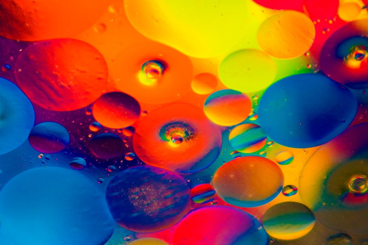
Imagine a landscape photograph where the warm hues of a setting sun are complemented by the cool tones of a tranquil river. The deliberate use of complementary colors not only adds aesthetic appeal but also draws the viewer’s attention to the contrasting elements, making the image visually captivating. Color theory empowers photographers to make such decisions with precision, turning each click of the shutter into a well-thought-out artistic statement.

Image by Larisa Koshkina from Pixabay
Basic Color Terminology
Here are some basic definitions and terminologies used in color theory:
- Hue: Hue refers to the pure, basic colors on the color wheel. It is what we commonly think of as color itself, such as red, blue, or green.
- Saturation: Saturation, also known as intensity or chroma, describes the richness or vividness of a color. Highly saturated colors are vibrant, while desaturated colors are more muted.
- Vibrance: Vibrance refers to the intensity and saturation of colors in an image. It specifically enhances the less saturated colors while sparing the already saturated ones, resulting in a more balanced and natural-looking enhancement.
- Value: Value represents the lightness or darkness of a color. A color’s value is determined by how much black or white is added to it.
- Tint: A tint is a color that has been lightened by adding white to it. It results in a pastel or lighter version of the original color.
- Shade: A shade is a color that has been darkened by adding black to it. It creates a deeper, darker version of the original color.
- Tone: A tone is achieved by adding both black and white to a color, resulting in a muted, more neutral version of the original hue.
- Complementary Colors: Complementary colors are pairs of colors that are opposite each other on the color wheel. When placed together, they create a strong contrast and enhance each other’s visual impact.
- Analogous Colors: Analogous colors are colors that are adjacent to each other on the color wheel. They share a similar undertone and create a harmonious, cohesive effect when used together.
- Triadic Colors: Triadic colors are three colors evenly spaced around the color wheel. When combined, they create a balanced and vibrant color scheme.
- Color Temperature: Color temperature refers to the perceived “warmth” or “coolness” of a color. It is often associated with the different qualities of light, such as warm sunlight or cool blue light.
- Color Harmony: Color harmony is achieved by selecting colors that work well together and create a pleasing visual balance. It involves using various color relationships to create an aesthetically pleasing composition.
- Color Contrast: Color contrast refers to the difference in hue, value, or saturation between different colors. It is used to create visual interest, direct focus, and emphasize elements in an image.
- Color Wheel: The color wheel is a circular diagram that arranges colors in a specific order, showcasing their relationships and helping artists and designers understand color harmonies and interactions.
- Warm Colors: Warm colors, such as reds, oranges, and yellows, evoke feelings of warmth, energy, and vibrancy.
- Cool Colors: Cool colors, including blues, greens, and purples, create a sense of calm, tranquility, and serenity.
Color Models and Coding Methods
When it comes to understanding Color Theory for Photographers, diving into the world of color models and coding methods might sound technical, but it’s a fascinating journey that can enhance your grasp of how colors work. In this section, we’ll demystify the concepts of color models and coding, shedding light on how they influence the way we perceive and work with colors in photography.
Understanding Color Models
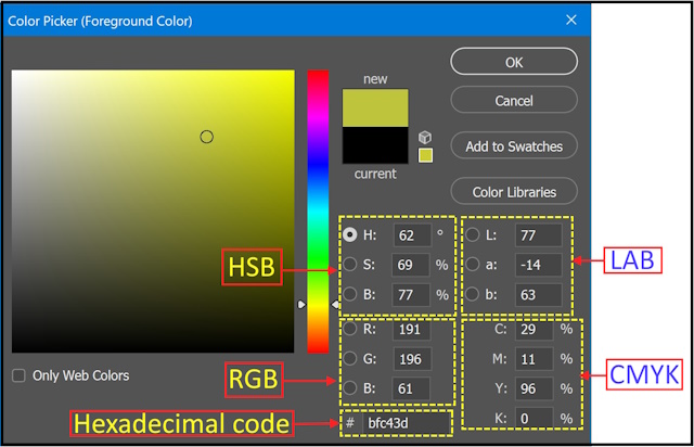
Color models are blueprints that define how colors are created and represented. They provide a systematic way to describe colors in a way that both humans and devices can understand. There are four color models: RGB, CMYK, HSB, and LAB.
-
RGB Color Model
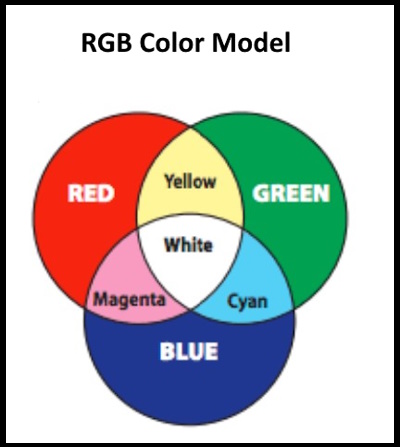
The RGB color model is like a magician’s trick that combines red, green, and blue light to create the myriad of colors we see on screens. This model mirrors how our eyes perceive colors through light. By mixing different intensities of red, green, and blue light, we can create an extensive palette of hues that come alive on digital displays.
RGB’s additive nature means that when these primary colors are combined at full intensity, they produce white light. This approach is perfect for devices like computer screens and projectors, where light is emitted to create colors.
-
CMYK Color Model
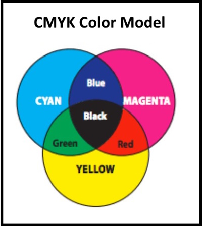
When it comes to the world of printing, a different color model takes the stage: CMYK. Think of CMYK as a painter’s palette. It stands for cyan, magenta, yellow, and key (black). These four colors work together through a subtractive process to create a wide range of printed colors.
In this model, pigments or inks are used to absorb certain wavelengths of light, subtracting them from the mix. When all four colors are combined at their maximum intensities, they create a deep, rich black. This is why the “K” stands for “key,” referring to the black key plate in traditional printing.
-
HSB Color Model
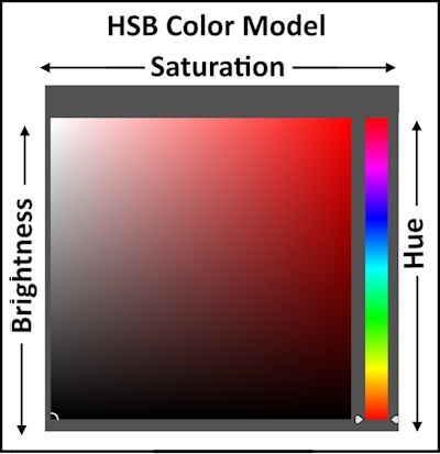
HSB (Hue, Saturation, and Brightness) functions as a color model employed to depict colors in digital images and computer graphics.
-
- Hue signifies the intrinsic color within an image, like red, blue, or green. The hue is depicted as an angle on a color wheel, where red occupies 0 degrees, green resides at 120 degrees, and blue occupies 240 degrees.
- Saturation delineates the color’s intensity or purity, rendering highly saturated hues vivid, while less saturated ones appear less vibrant or somewhat grayish. Saturation and brightness adopt values between 0 and 100. Zero implies complete unsaturation or black, while 100 signifies full saturation or white.
- Brightness, also termed value or lightness, gauges the luminosity of the color. Brighter shades possess elevated values, while darker ones embody lower values.
-
The LAB color model
It is employed in digital image manipulation and computer graphics and mirrors human vision. It comprises three elements: L: lightness (), A: ranging from green to red, and B: spanning from blue to yellow.
Unlike other color spaces, the LAB color model is independent of devices such as printers or monitors, ensuring its universality across various platforms. These values allow precise control over color, making them essential in graphic design, image editing, and programming.
Hexadecimal Color Codes
Hexadecimal color codes are like secret combinations that computers use to understand and display colors. They consist of six characters, including numbers (0-9) and letters (A-F). For instance, code #FF5733 represents a vibrant shade of orange.
This coding method is widely used in web design and digital graphics. It’s a concise way to specify colors and ensure consistency across different devices and platforms.
There are different ways to find the hex code for a color you like. One of them, you can use an online website such as color picker that shows you the hex code of any color you choose.
Also, you can use the color picker tool of Photoshop to show and adjust your colors using any one of the different color models, as shown below:
In Conclusion, as a photographer, understanding color models and coding methods offers you a broader palette of possibilities. Whether you’re creating digital visuals, editing images, or fine-tuning your printing process, these concepts empower you to speak the language of colors fluently.

Understanding the Basics of Color Theory
The Color Wheel and Its Components
The color wheel is a visual representation of the relationships between colors. It’s a circular arrangement of colors in a specific order that helps us understand how colors relate to one another and how they can be combined to create visually pleasing compositions.
The color wheel is a fundamental tool in art, design, and color theory, including in the context of photography. It is shown below
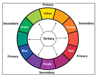
Primary colors, secondary colors, and tertiary colors are the building blocks of the color wheel and play a fundamental role in color theory and art. Let’s explore each category:
-
Primary Colors:
Primary colors are the foundation of all other colors and cannot be created by mixing other colors together. In traditional color theory, there are three primary colors:
-
- Red
- Blue
- Yellow
These three colors are used to create a wide range of other colors through mixing.
-
Secondary Colors:
Secondary colors are created by mixing equal parts of two primary colors. There are three secondary colors, each located between two primary colors on the color wheel:
-
- Green (created by mixing blue and yellow)
- Orange (created by mixing red and yellow)
- Purple (created by mixing red and blue)
Secondary colors are vibrant and dynamic, and they add diversity to color palettes.
-
Tertiary Colors:
Tertiary colors are the result of mixing a primary color with an adjacent secondary color. These colors bridge the gap between primary and secondary colors, offering a wide range of shades with varying degrees of intensity. There are six tertiary colors in total:
-
- Red-Orange (a mixture of red and orange)
- Yellow-Orange (a mixture of yellow and orange)
- Yellow-Green (a mixture of yellow and green)
- Blue-Green (a mixture of blue and green)
- Blue-Purple (a mixture of blue and purple)
- Red-Purple (a mixture of red and purple)
Tertiary colors provide subtlety and complexity to color compositions, allowing for more nuanced and sophisticated visual effects.
Warm and Cool Colors
Within the color wheel, colors can be divided into two main categories: warm and cool. Warm colors, like fiery reds, sunny yellows, and earthy oranges, exude energy, vibrancy, and passion. They can instantly draw attention and create a sense of warmth and intimacy in your photographs.

On the flip side, cool colors, such as serene blues, tranquil greens, and soothing purples, evoke a sense of calmness, serenity, and expansiveness. They can lend a refreshing touch to your images, making them ideal for capturing tranquil landscapes or creating a sense of distance and depth.
*
Warm and cool colors create different emotional responses. It’s important to note that the perception of warm and cool colors can vary based on cultural and personal experiences, so it’s always a good idea to consider the context in which the colors are being used.
Color Harmony and Its Impact on Visual Appeal
Color harmony is the secret ingredient that can transform a photograph from good to breathtaking. It’s the art of skillfully combining colors in a way that pleases the eye and evokes specific emotions.
Understanding various color harmonies is a crucial tool in the arsenal of any photographer, enabling you to create images that resonate deeply with your audience.
In photography, achieving color harmony involves the deliberate choice of colors that harmonize well when combined. Photographers utilize various color harmony principles to craft images that exhibit balance and visual appeal. The following are common ways to achieve color harmony:
-
Complementary Colors
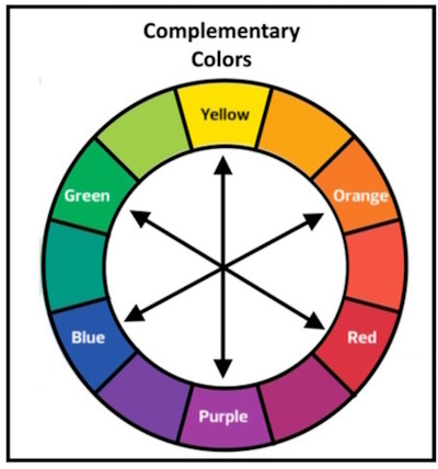
Complementary colors are a match made in color heaven – they sit opposite each other on the color wheel, creating a dynamic and captivating contrast. When paired, complementary colors intensify each other, making both hues pop and grab attention. Think about a vibrant red subject against a lush green background – the contrast between these complementary colors creates an electrifying visual impact that’s hard to ignore.
-
Analogous Colors
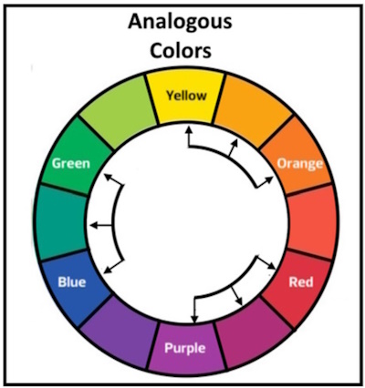
Analogous colors are like best friends on the color wheel. They are neighbors, sharing similar hues and creating a harmonious and cohesive feel in your photographs. For instance, blending shades of blue, blue-green, and green can create a serene and unified composition that’s visually soothing and pleasant.
-
Triadic Color Schemes
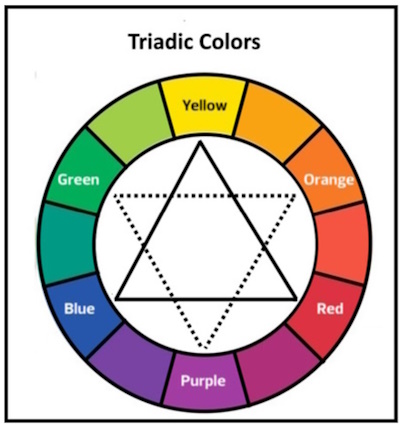
Triadic color schemes are all about balance and vibrancy. By selecting three colors that are evenly spaced around the color wheel, you can achieve a harmonious yet visually stimulating effect. Imagine combining shades of red, blue, and yellow – the resulting image would be vibrant and balanced, capturing the viewer’s attention while maintaining a sense of equilibrium.
-
Split Complementary Colors
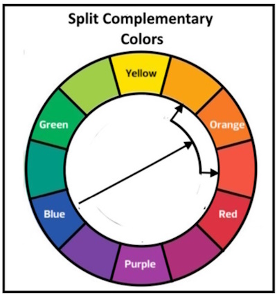
Split complementary colors are a variation of the complementary color scheme. Instead of using two opposite colors, a split complementary scheme uses a base color and two adjacent colors to complement the color.
As a photographer, mastering these fundamental aspects of the color wheel and its components empowers you to infuse your work with intention and creativity. By understanding primary, secondary, and tertiary colors, as well as the dynamics of warm and cool hues, you’ll have a colorful palette at your disposal. Moreover, delving into the world of color harmony and its various schemes will open up a realm of possibilities, enabling you to create photographs that are not only visually appealing but also emotionally resonant.
Psychological Effects of Colors on Photography
As we delve further into the world of Color Theory for Photographers, it’s important to recognize that colors are more than just visual elements – they carry profound psychological effects that can deeply impact the emotions, mood, and cultural interpretations of your photographs. In this section, we’ll uncover how colors wield the power to convey emotions, create atmospheres, and resonate with diverse cultures.
-
Conveying Emotions Through Colors
Colors are a universal language of emotions. The hues you choose can evoke feelings, sometimes even more powerfully than words. Imagine a vibrant sunset photograph with warm oranges and deep purples – these colors can instantly evoke feelings of warmth, nostalgia, and serenity.

Photo by Pok Rie
-
Creating Mood and Atmosphere with Color Palettes
Color palettes are the brushstrokes that paint the mood and atmosphere of your photographs. Whether it’s a lively street scene captured with vibrant yellows and energetic reds or a serene landscape adorned in cool blues and greens, color palettes set the tone and engage the viewer’s senses.
The below photo of a cozy living room uses a warm color palette of reds, oranges, and yellows to create a feeling of warmth and comfort.

Image by Jill Wellington from Pixabay
-
Cultural Significance of Colors
Colors hold cultural significance, often varying greatly from one culture to another. For example, while white symbolizes purity and weddings in some cultures, it’s associated with mourning in others. Being mindful of these cultural interpretations is vital when selecting colors for your photographs.
For example, green is often associated with nature, growth, and fertility in Western cultures. In Islam, green is the color of the Prophet Muhammad. In Ireland, green is the national color.

Photo by John Hurley
Applying Color Theory to Photographic Composition
Integrating Color Theory for Photographers into your photographic composition can transform your images from snapshots to captivating works of art. Let’s explore how color theory can be harnessed to create visually compelling compositions that grab attention and tell stories.
-
Color as a Focal Point
Colors can serve as powerful focal points, drawing the viewer’s gaze to a specific element within the frame. Vibrant or contrasting colors naturally stand out against their surroundings, making them ideal for highlighting subjects. A vivid red flower amid a sea of green foliage immediately grabs attention, making it the star of the photograph.
Another example is the below photo, which shows a beautiful sunset over the ocean. The sky is ablaze with vibrant colors, from orange to pink to purple. The colors are so intense that they are impossible to ignore.

Image by Giani Pralea from Pixabay
-
Using Colors to Lead the Viewer’s Eye
Colors can be employed as visual guides, directing the viewer’s eye through the photograph. By strategically placing colors along a path, you lead the viewer on a visual journey. Think of a photo of a flower with bright yellow petals against a dark background. The yellow petals are very eye-catching and draw the viewer’s attention to the center of the flower.

-
Balancing Colors in the Frame
Achieving color balance is crucial to prevent overwhelming or underwhelming the viewer. Too much of a single color might create monotony, while an excess of contrasting colors can lead to chaos. Aim for a harmonious balance that complements your subject and story.
For example, in the below photo, the photographer catches the Complementary colors. These are colors that are opposite each other on the color wheel. When used together, they create a strong and vibrant contrast. For example, this photo of a sunset uses the complementary colors of orange and blue to create a dramatic effect.

Image by Harsh Vardhan Art from Pixabay
-
Contrast and Its Role in Highlighting Subjects
Contrast is a dynamic tool in color photography. The stark difference between colors enhances the visual impact. Dark subjects against a bright background or light subjects against a dark background create instant contrast, guiding the viewer’s focus.
The below photo shows the person’s silhouette is highlighted against the bright colors of the sunset, making them stand out from the background.
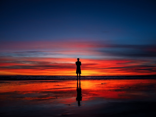
Photo by Maciej Pienczewski on Unsplash
Color in Different Lighting Conditions
As a Color Theory for Photographers enthusiast, you’ll soon discover that the magic of color isn’t just about selecting the right hues – it’s also about understanding how lighting conditions can dramatically influence the way colors appear in your photographs. Let’s delve into the fascinating world of color dynamics in various lighting scenarios.
-
Natural Light and Color Dynamics
Natural light is a versatile artist that shifts its tones and colors throughout the day. During the golden hour, warm sunlight bathes your scenes in hues of orange and gold. As the day progresses, natural light transforms, casting cooler shades during the blue hour.
Tip: Embrace the magic of natural light by timing your shoots to capture the enchanting transitions between warm and cool tones.
For example, the below photo has a warm color cast, with the orange leaves of the trees standing out. The overall effect is very autumnal and serene.
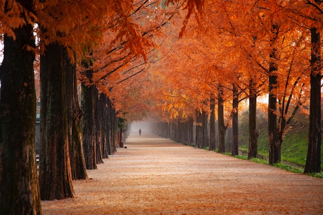
Photo by 김 대정
-
Artificial Light Sources and Color Temperatures
Artificial light sources introduce a twist to the color story. Each type of light – be it incandescent, fluorescent, or LED – emits its unique color temperature. Incandescent light leans toward warm tones, while fluorescent light often casts cooler hues.
Tip: Experiment with different artificial light sources to understand how they affect your subject’s colors and the overall mood of your photographs.
The below photo shows a blue color cast, A color cast is an overall tint of a particular color in an image, often caused by the lighting conditions when the photo was taken. In this case, the blue color cast is due to the street’s artificial lighting at night.

Photo by Inline Media
-
White Balance Adjustments for Accurate Color Representation
White balance is your secret weapon against color distortions caused by varying lighting conditions. It ensures that the whites in your photograph appear neutral, which, in turn, leads to accurate color representation.
Tip: Adjust your camera’s white balance settings to match the lighting scenario. Custom white balance settings can be invaluable for capturing colors as you perceive them.
Practical Tips for Implementing Color Theory
As you delve into the world of Color Theory for Photographers, applying the concepts you’ve learned to your photography can bring your creative vision to life. Let’s explore some practical tips that will help you harness the power of color theory to craft captivating and visually stunning images.
-
Planning Color Palettes Before a Shoot
Before you even press the shutter button, take a moment to plan your color palette. Consider the location, subject, and desired mood of your photograph. Are you aiming for a serene landscape with cool blues and greens, or a vibrant urban scene with pops of red and yellow? Having a clear color palette in mind helps you make intentional choices during the shoot.
-
Experimenting with Different Color Combinations
Color theory encourages experimentation. Don’t be afraid to combine colors in unconventional ways to create visual interest. Play with complementary colors to make your subject pop, or experiment with analogous colors for a harmonious and soothing effect. Remember, photography is an art, and exploring new color combinations can lead to unique and captivating results.
-
Keeping the Focus on the Subject
While color theory can elevate your photography, the subject should always remain the star of the show. Colors should enhance the story you’re telling, not overshadow it. When selecting your color palette, consider how it complements and supports the narrative or emotions you want to convey.

Challenges and Solutions in Colorful Photography
As we delve deeper into the realm of Color Theory for Photographers, it’s important to acknowledge that working with colors isn’t always a smooth ride. Vibrant photography often comes with its own set of challenges. In this section, we’ll explore two common challenges photographers face when dealing with colors and offer practical solutions to overcome them.
-
Dealing with Clashing Colors
Have you ever captured a scene that looked breathtaking in real life, only to find the colors clash when you view the photograph? This phenomenon, known as color clashing, occurs when colors that don’t naturally harmonize are placed together in an image. It can disrupt the visual flow and impact the overall aesthetic appeal.
Solution: Picking the Right Color Palette
To avoid color clashes, start by understanding color harmonies. Select colors that complement each other based on color wheel relationships. Utilize complementary, analogous, or triadic color schemes to create a balanced and visually pleasing composition. Remember, careful planning and mindful color choices can prevent clashes and elevate your photographs.
-
Managing Color Distortion in Printing
Printing your vibrant photographs is an exciting step, but it comes with a challenge: color distortion. Your perfectly edited digital image might appear different when printed due to variations in printing technologies, inks, and paper types. This discrepancy can be frustrating, especially after investing time in perfecting the digital version.
Solution: Calibrating Your Workflow
To overcome color distortion in printing, adopt a calibrated workflow. Begin by calibrating your monitor using hardware or software tools to ensure on-screen accuracy. Then, soft-proof your images before printing. Soft-proofing involves simulating the printing process on your screen to anticipate how colors will appear in print. Adjustments can be made to achieve desired results.
Conclusion
In the vibrant world of photography, mastering color theory isn’t just a skill; it’s a doorway to unlocking the full potential of visual storytelling. From understanding the psychological impact of colors to harnessing their dynamic interplay, this comprehensive guide has illuminated the art and science of color for photographers.
We’ve explored the essence of color models, dived into the psychology of hues, and delved into practical techniques that elevate compositions. From navigating the complexities of various lighting conditions, we’ve uncovered the secrets that allow colors to breathe life into your photographs.
This guide equips photographers to tell stories and evoke emotions through the vibrant language of color. Embrace color theory as your artistic palette, allowing your photographs to resonate, captivate, and communicate beyond words.
Related posts
Color Meanings In Different Cultures
Color Harmony in Photography- Things You Need To Know
Color Calibration Of Monitors – How To Calibrate Your Monitor
Thanks for reading, I hope you enjoyed the article, in case you have any questions just drop them below & I will be happy to answer you.
The featured Photo by Rebecca Diack
If you enjoy the site, don’t forget to subscribe, we will only inform you when a new article is posted.


This article is a fascinating read about colors in photographs and how to utilize color theory to create art. The list of basic terminology helps to understand the article and also other information I have previously learnt but not fully understood. I found it fascinating how many different theories there is and how you can combine different colors to make them mean different emotions. Do you know why green is classed as a cool color? I would have thought it to be more neutral.
I’m glad to hear that you found the article on colors in photographs fascinating and that the list of basic terminology was helpful in understanding the topic.
Regarding your question about why green is considered a cool color, it’s because green is often associated with nature and has a calming and soothing effect, similar to other cool colors like blue and purple. Cool colors tend to recede in the color spectrum, giving a sense of distance, openness, and tranquility. While green can indeed be considered a neutral color in some contexts, its connection to nature and its overall psychological impact categorize it as a cool color in the realm of color theory. It’s a versatile color that can convey different emotions depending on its context and how it’s combined with other colors.
This blog post is truly enlightening, and it resonates deeply with my passion for photography. As a photographer, I understand how crucial color theory is in creating captivating and impactful images. This comprehensive guide provides valuable insights and practical tips that align perfectly with my experiences in experimenting with colors in photography. It’s an invaluable resource for photographers seeking to elevate their skills and create visually stunning compositions. Thank you for sharing this insightful and comprehensive guide!
I’m thrilled to hear that you found the blog post enlightening and that it resonates with your passion for photography, especially regarding color theory. It’s wonderful that you see the value in the insights and practical tips provided in the guide, and that they align with your own experiences.
Thank you for your kind words, and I’m glad you found the guide insightful and comprehensive. Keep creating visually stunning compositions!