

Color harmony, also known as color balance or color coordination, refers to the pleasing arrangement of colors in an image. It requires a deep understanding of color theory, the use of color palettes, and the composition of the photograph.
Color harmony in photography also refers to the effective use of colors to create a visually pleasing and balanced image. It involves the use of colors that complement each other, creating a sense of unity and balance within the photograph.
There are several ways to achieve color harmony in photography. One common approach is to use colors that are adjacent to the color wheel, such as red and orange or blue and green. Another approach is to use complementary colors, which are directly opposite each other on the color wheel, such as blue and orange or red and green.
It’s also important to consider the intensity of colors and how they interact with each other in the photograph. Using colors that are of similar intensity can create a subtle and calming effect while using colors of high intensity can create a bold and dynamic effect.
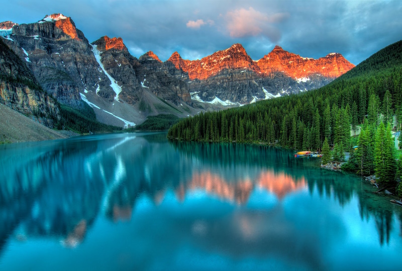
Photo by James Wheeler
Understanding the Color Theory
Understanding color theory is essential in creating visually appealing and harmonious compositions in photography, painting, graphic design, and other creative fields.
What is a color wheel?
The color wheel (an illustrative model of color) shows the relationships between the primary, secondary, and intermediate/ tertiary colors and helps demonstrate color temperature.
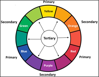
The color wheel is based on three categories:
-
Primary colors:
Red, blue, and yellow, cannot be created by mixing other colors. By combining these primary colors in different proportions, secondary and tertiary colors are formed.
-
Secondary colors
Are created by mixing two primary colors, such as purple (red + blue), green (blue + yellow), and orange (red + yellow).
-
Tertiary colors
Are formed by mixing a primary color with a secondary color.
Meaning of cool & warm colors (color temperature)
Another aspect of color theory is the classification of colors into three groups: warm, cool, and neutral.
-
Warm colors
warms colors are those that have yellow, orange, or red hues. They create a sense of warmth, energy, and positivity in our minds.

-
Cool colors
are those that have green, blue, or purple hues. They create a sense of calmness and relaxation in our minds.

-
Neutral colors
are those that have no hue or a mixture of hues, including black, white, gray, tans, and browns. They can be warmer or cooler depending on their undertones, which are the subtle hints of color that influence their appearance.

Warm and cool colors refer to specific groups of colors that create different emotional responses. It’s important to note that the perception of warm and cool colors can vary based on cultural and personal experiences, so it’s always a good idea to consider the context in which the colors are being used.
Color Models: CMYK, RGB, HSB, and Lab
Color models are systems that use numbers to describe colors. CMYK and RGB are two popular color models used in graphic design. There are also the HSB and Lab color models.
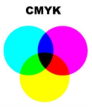
- CMYK stands for Cyan, Magenta, Yellow, and Black. It is a color model that works by subtracting light from white. CMYK is used for printing with ink on paper or other surfaces. The more ink you use, the darker the color gets.
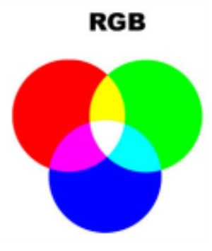
- RGB stands for Red, Green, and Blue. It is a color model that works by adding light to black. RGB is used for showing colors on screens such as computers, TVs, or phones. The more light you use, the lighter the color gets.
- HSB (Hue, Saturation, and Brightness) is a color model used to represent colors in digital images and computer graphics.
- Hue refers to the color of the image, such as red, blue, or green.
The hue is represented as an angle on a color wheel, with red at 0 degrees, green at 120 degrees, and blue at 240 degrees.
-
- Saturation refers to the intensity or purity of the color, with highly saturated colors appearing vivid and less saturated colors appearing dull or grayish.
Saturation and brightness are represented as values between 0 and 100, with 0 being completely unsaturated or black, and 100 being fully saturated or white.
-
- Brightness, also known as value or lightness, refers to the brightness of the color, with brighter colors having higher values and darker colors having lower values.
- LAB: the LAB color model is a color space used in digital image processing and computer graphics. It is designed to approximate human vision and has three components: lightness (L), a (green to red), and b (blue to yellow).
The LAB color model is a device-independent color space, meaning it is not tied to any specific device, such as a printer or monitor.
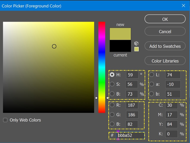
To know the relation between the four color models, you may use the color picker tool in Photoshop. Pick up any color from your image, then the property window will show the value of this color in the four mentioned models.
Hexadecimal code
Hexadecimal code is a way of naming colors using numbers and letters. It is based on the RGB color model, which uses combinations of red, green, and blue to create any color. Hexadecimal code uses six digits to represent each color, with a hash mark (#) at the beginning as shown below
#RRGGBB, where RR is the red value, GG is the green value, and BB is the blue value.
Each value can range from 00 to FF in hexadecimal notation, which is equivalent to 0 to 255 in decimal notation.
For example, #FF0000 is pure red, #00FF00 is pure green, and #0000FF is pure blue. Hexadecimal code is used for web design because it allows designers to specify colors precisely and consistently across different browsers and devices.
How to find the hex code for a color:
There are different ways to find the hex code for a color you like. One of them, you can use an online color picker that shows you the hex code of any color you choose. Also, you can use the color picker of Photoshop.
Color harmony concepts
Color harmony in photography is achieved by selecting colors that are visually pleasing when viewed together. There are several color harmony concepts that photographers use to create balanced and aesthetically pleasing images.
-
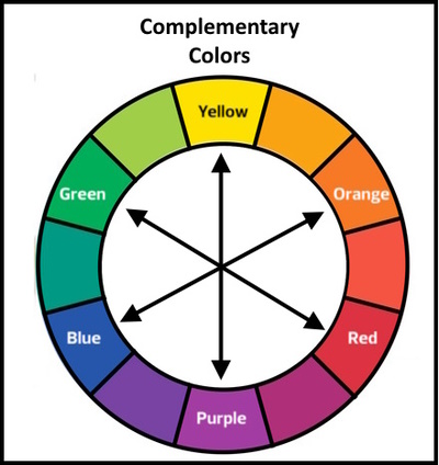
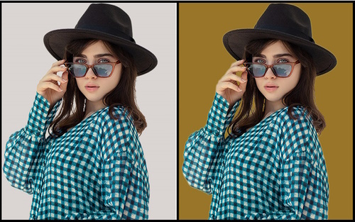
Complementary Colors:
Complementary colors are opposite to each other on the color wheel. For example, red and green, blue and orange, and yellow and purple are complementary colors. When used together, complementary colors create a strong contrast that can be visually striking.
For example, in the below photo, we change the background color to a complementary color of the subject dress
-
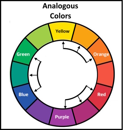
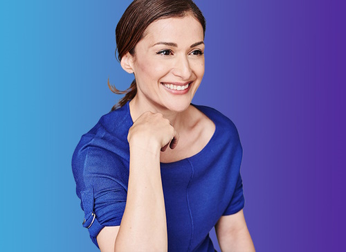
Analogous Colors:
Analogous colors are colors that are adjacent to each other on the color wheel. These colors have a similar hue and create a sense of unity and cohesiveness in a photograph. For example, yellow, yellow-green, and green are analogous colors.
The below photo shows the concept of analogous colors, the background gradient is formed from two analogous colors of the woman’s dress.
-
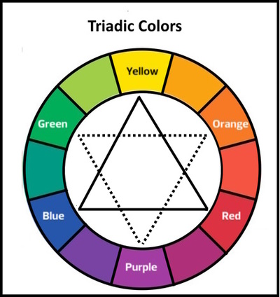
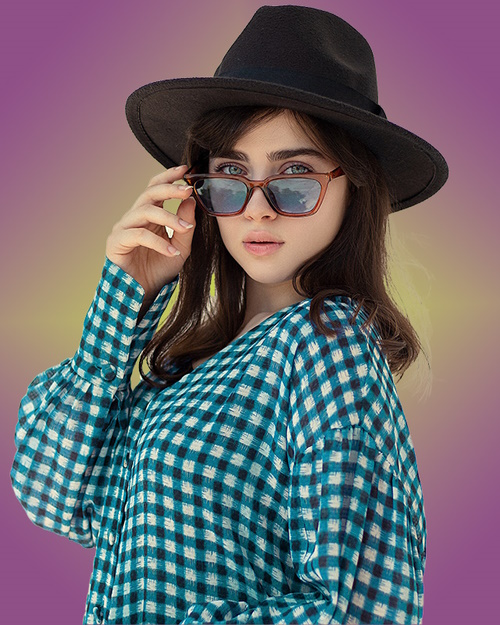
Triadic Colors:
Triadic colors are three colors that are equidistant from each other on the color wheel, forming an equilateral triangle. For example, red, yellow, and blue are triadic colors. When used together, these colors create a harmonious and balanced composition.
The below photos show the concept of using triadic colors, the color of the dress and the colors of the gradient in the background are triadic colors.
-
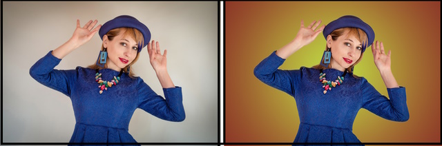
Split Complementary Colors:
Split complementary colors are a variation of the complementary color scheme. Instead of using two opposite colors, a split complementary scheme uses a base color and two adjacent colors to complement the color.
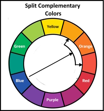
For example, if the base color is blue, the split complementary scheme can use yellow-orange and red-orange. Split complementary colors create a balanced and harmonious contrast in your design. They are more interesting than just using two complementary colors.
The below example shows the idea, we pick up the two split colors of the lady dress and change the background color with a gradient of these two colors.
-
Monochromatic Colors:
Monochromatic colors refer to a color scheme that is composed of variations of a single hue, i.e., a single color. This means that a monochromatic color scheme will use different shades, tints, and tones of the same color.
- Shades are created by adding black to a color, which makes it darker and lowers its brightness. Shades of color appear more subdued and less vibrant than the original color. For example, a shade of red would be maroon or burgundy.
- Tints are created by adding white to a color, which makes it lighter and raises its brightness. Tints of color appear softer and more delicate than the original color. For example, a tint of blue would be light blue or baby blue.
- Tones are created by adding gray to a color, which desaturates it and lowers its chroma or intensity. Tones of color appear more muted and sophisticated than the original color. For example, a tone of green would be olive or sage.
A monochromatic color scheme can include any color, not just black and white. For example, a monochromatic color scheme can be created using different shades of blue or green.
Understanding color theory can help photographers create images that are visually balanced, harmonious, and pleasing to the eye. By using different color schemes and combinations, photographers can create unique and creative compositions that stand out from the rest.
What is the Color Palette?
A color palette is a range of colors that work well together and complement the subject of the photograph. Choosing a color palette depends on the desired mood, genre, and style of the photograph. For example, a warm color palette can create a sense of coziness, while a cool color palette can evoke calmness and serenity.
When to use color palettes in photography?
Color palettes in photography can be used both before and after taking the shots. Before taking the shots, you can look for scenes that have a limited or harmonious color palette, such as complementary colors, analogous colors, or monochromatic colors. You can also use props, clothing, or filters to add or change colors in your scene.
After taking the shots, you can use post-processing tools like Photoshop to enhance or modify the colors in your photos. You can adjust the saturation, hue, luminance, contrast, white balance, and other settings to make your colors more vivid or subtle.
You can also use selective color adjustments to target specific colors and change them individually. For example, you can increase the saturation of the blue and gold colors in a sunset photo by using an adjustment layer. This way, you can create a color palette that suits your style and taste.
By using a color palette in photography before and after taking the shots, you can create stunning images that showcase your creativity and skill.
How to Choose a Color Pallete
In today’s digital age, there are numerous tools available to help photographers select the perfect color palette. Many websites offer color palette generators that can help you choose colors based on specific criteria such as complementary, monochromatic, or analogous color schemes. These tools can help you create a harmonious color palette in no time.
- Coolors – This is a popular color palette generator that offers a vast range of color schemes. You can create a palette from scratch or generate a random one based on your preferences.
- Adobe Color – Formerly known as Adobe Kuler, this color tool is a favorite among designers. You can create color themes based on color rules, including complementary, triad, and shades.
- Canva Color Palette Generator – This tool offers a simple way to create a palette based on your preferred color. You can also explore trending color palettes created by other designers.
- Material Palette – This is a tool that offers color schemes based on Google’s Material Design. You can select your primary and secondary colors and generate a palette based on those selections.
- Color Hunt – This is a community-driven color palette generator. You can browse thousands of user-generated palettes and filter them based on popularity, newest, or random.
How to control the Mood
Color is one of the most powerful ways to convey mood and atmosphere in photography. Different colors can evoke different emotions and feelings in the viewer, depending on their hue, saturation, luminance, contrast, and temperature. To determine the mood of a photo using color, you can consider the following factors:
-
The type of color:
1- Warm colors (red, orange, yellow) tend to create a feeling of excitement, passion, energy, or warmth.
2- Cool colors (green, blue, violet) tend to create a feeling of calmness, serenity, freshness, or coldness.
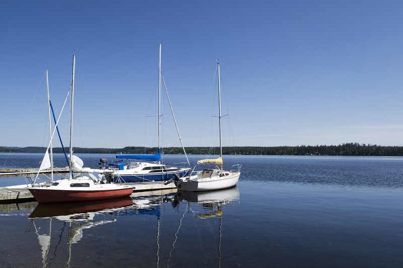
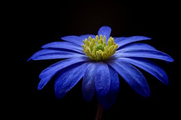
Image by M. Maggs from Pixabay
3- Neutral colors (black, white, gray) tend to create a feeling of balance, simplicity, elegance, or dullness.
Photo by Balamurugan Anbazhagan
-
The color palette (scheme):
The color scheme is the combination of colors used in a photo. There are different types of color schemes based on the color wheel:
-
- Complementary (opposite colors)
- Analogous (adjacent colors)
- Monochromatic (same hue with different shades or tints),
- Triadic (three equally spaced colors), tetradic (two pairs of complementary colors), etc. Each color scheme can create a different mood and harmony in a photo.
-
The color variables:
The color variables are the aspects of color that can be adjusted or manipulated in photography:
-
- Hue (the name of the color)
- Saturation (the intensity or purity of the color)
- Luminance (the brightness or darkness of the color)
- Contrast (the difference between light and dark areas)
- Temperature (the warmth or coolness of the color)
Each color variation can affect the mood and atmosphere of a photo by making it more vivid or subtle.
-
The dominant color:
The dominant color is the most prominent or noticeable color in a photo. It can draw attention to a specific subject or element in a photo and set the overall tone and mood. For example, a dominant red can create a sense of drama or danger; a dominant blue can create a sense of tranquility or sadness; a dominant yellow can create a sense of joy or optimism.
Photo by Ahmad Ramadan
Consider the Subject
An important aspect to consider when choosing a color palette is the subject of your photograph. Different colors can evoke different emotions and have different meanings in various cultures. For instance, red is associated with love and passion, while yellow represents happiness and optimism. Consider the emotions you want to convey through your photograph and select a color palette that aligns with the subject.
Photo by Pixabay
-
Mind the contrast
There are several ways to create contrast in your color palette, including using complementary colors, contrasting shades of the same color, or using a single bold color against a neutral background. Experiment with different combinations of colors to find the perfect contrast for your image.
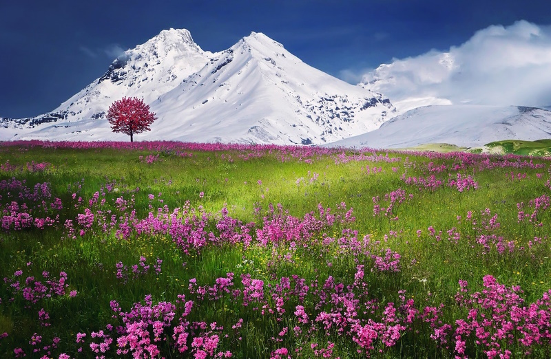
Photo by Pixabay
-
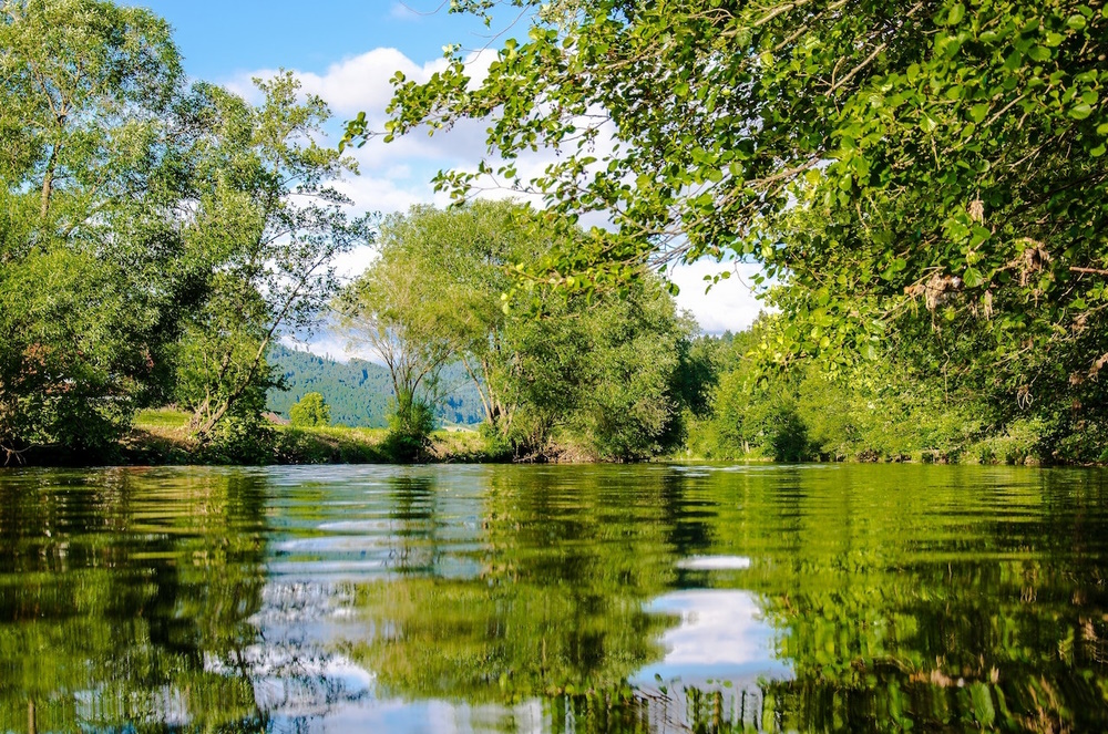
Find Inspiration from Nature
Nature is an excellent source of inspiration for color palettes. The colors found in nature are inherently harmonious, and you can use them as a starting point for your photography. Take a walk in the park or countryside and observe the colors around you. Notice how different colors blend together and create a visually pleasing composition.
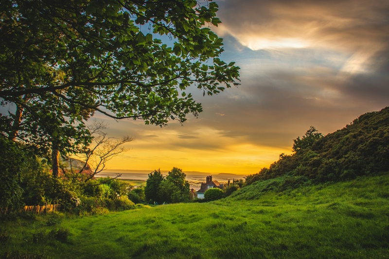
Photo by Lisa Fotios
-
Study Famous Artists and Photographers
Many famous artists and photographers have used color to create iconic works of art. Studying their work can give you insight into how they use color to create mood and emotion in their photographs. Take note of the colors they use, how they combine different shades, and how they use color to emphasize specific elements in the image. Here are some of the famous photographers in the world:
Ansel Adams – Ansel Adams is perhaps the most famous landscape photographer of all time. He was known for his stunning black-and-white images of the American West, particularly Yosemite National Park.
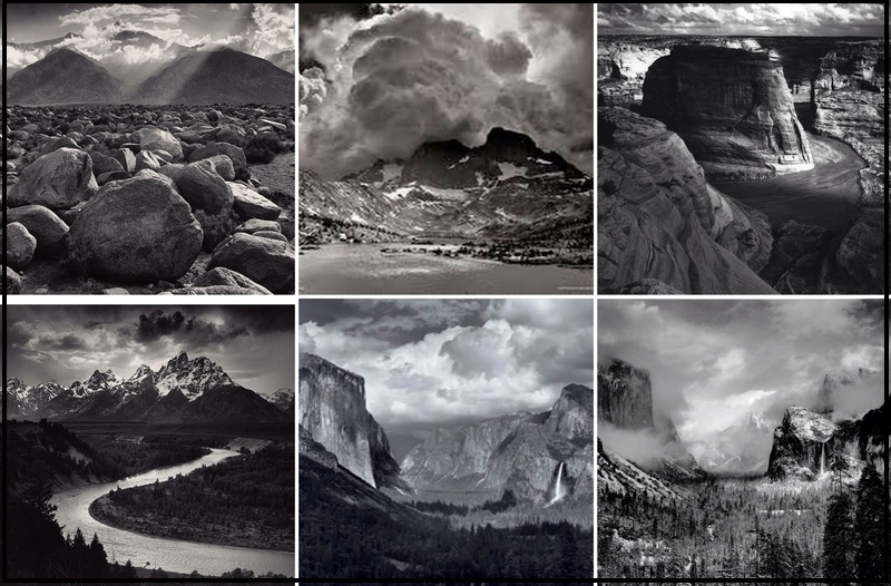
photos @ Instagram
Galen Rowell – Galen Rowell was a renowned landscape photographer and mountaineer. He was known for his vibrant color images of wilderness areas around the world, particularly in the Himalayas.
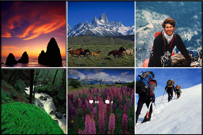
photos @ Instagram
Art Wolfe – Art Wolfe is a nature and landscape photographer who has worked on numerous books and television programs, including the PBS series “Travels to the Edge with Art Wolfe.” He is known for his striking compositions and his ability to capture the essence of a place.
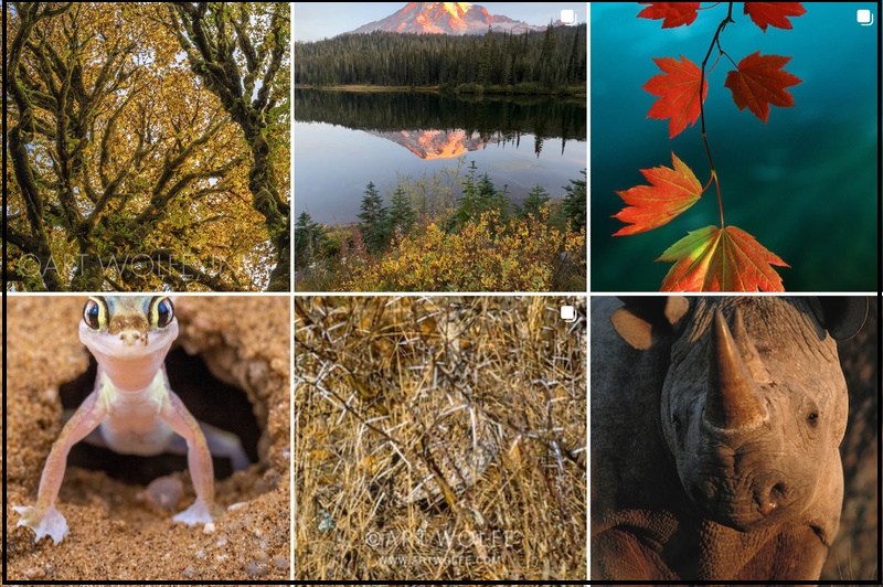
photos @ Instagram
Edward Burtynsky – Edward Burtynsky is a Canadian photographer who is known for his large-format images of landscapes altered by human activity. His work often focuses on industrial and urban environments.
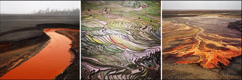
photos @ Instagram
Conclusion
Choosing the right color palette for your photography is essential to creating a visually appealing and impactful image. Understanding color theory, considering the mood and subject of your photograph, using color palette tools, finding inspiration in nature and famous artists, experimenting with color, and using contrast are all important factors to consider when creating color harmony in your photos.
Related posts
Add Color To Black & White Photo
Turn Color Photos Into Black & White
How To Color Grade In Photoshop
How To Change The Color Of Something On Photoshop
Color Calibration Of Monitors – How To Calibrate Your Monitor
Thanks for reading, I hope you enjoyed the article, in case you have any questions just drop them below & I will be happy to answer you.
The featured Photo by Pixabay
If you enjoy the site, don’t forget to subscribe, we will only inform you when a new article is posted.


Ehab Photography’s has a high degree of explanation regarding how to harmonize colour in a photograph. The information on colour theory is exhaustive and necessary to create beautiful photographs that draw your audience in. This can, of course, be used with many forms of visual art but knowing colour theory is essential for photography. I love that this information is put simply and completely. Just great
It sounds like you found the article very helpful. Color theory is indeed an important aspect of photography and other visual arts. Is there anything else you would like to know about color theory or any photography-related subjects, I am always here and ready to answer.
Wow you have such great detail on your website and the use of all the images are fabulous. I found it extremely insightful and I learnt a lot. I think it would be so helpful to people that are looking to start out in photography. I learnt a lot about colour palettes and how important it is
Thanks for your comment, your words are very supportive, and it’s great to hear that you found the article helpful and insightful. It’s always encouraging to receive positive feedback on one’s work, so I really appreciate it!