To define composition in photography, you can say it is arranging the elements of your frame in a way that best suits the core idea or goal of your work.
Composition is an aspect of photography and any kind of art, and it is hard to learn, it is about the organization of the elements in a work of art. For example, a well-composed piece of music lets you feel, enjoy, and receive clearly the intended message sent by the composer.
Since the beginning of photography, some rules of composition have been developed to help us achieve a good composition, but photographers, sometimes break or twist these rules to express their point of view.
Define composition in photography
Composition in photography is the positioning and arranging of the objects in the frame in such a way that the viewer’s eye is drawn to the most interesting area of the capture.
Arranging elements can be done in different ways:
- By actually moving the objects or subjects, for example when shooting a portrait.
- By planning for a suitable composition. For example when shooting landscapes involving sunset or sunrise scenes.
- By waiting for the suitable composition. When the photographer has not the choice of moving his subjects as in street photography, he has to wait for his subjects to make the most suitable position within the frame.
- By changing your own position. Such a way is appropriate in circumstances when the photographer cannot physically move his subjects, like landscape photography.
You have to give a lot of thought before capturing an image because a bad composition can ruin your photograph completely, and it cannot be fixed in post-processing, although using cropping tools sometimes can save an image.
Composition Principles and aspects
Composition principles and aspects are the primary compositional element of a photograph; they are something to look for in a photo, something that makes a photo interesting. In addition, each of these compositional elements can be combined together, to finally add that unique composition to your photo.
Compositional elements
- Shape and Form
Shape and Form are two of the most commonly misunderstood elements of composition in photography. The shape is simply the two-dimensional outline of an object or subject, Form is similar to shape but has a three-dimensional aspect created by light and shade.
Sometimes, looking for an interesting form in the scene will add an interesting element to the image. Forms can be a building, stairs, etc.
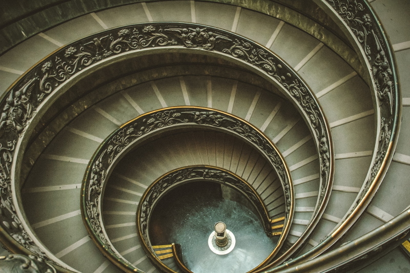
Photo by Paul IJsendoorn from Pexels
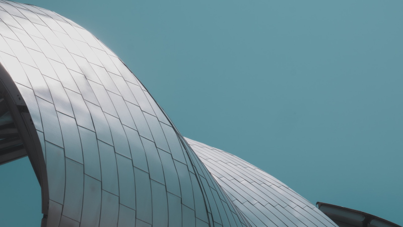
Photo by Laurent Vénérosy on Unsplash
- Lines
Lines are one of the best ways to direct the attention of the viewer to specific parts of a frame
Leading lines are lines that guide the viewer into the frame, towards the subject. In addition to lines that lead into a composition, you can have multiple lines that converge into the frame, or towards the subject. The photo below illustrates the idea.

Photo by Fabien Maurin on Unsplash
- Pattern
Many of us are fascinated with a pattern; any repeated forms or shapes have their inherent beauty. They are used in the composition of photos as shown below:
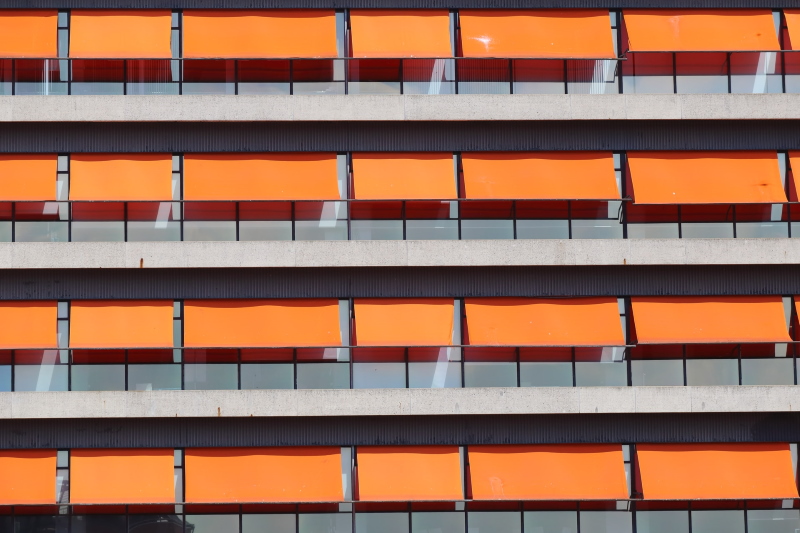
Photo by Martin Woortman on Unsplash
- Value
Value is a description of an area’s relative lightness or darkness. Therefore, it relates to a greyscale more than the color wheel. In a sense, value mostly ignores hue and operates only on the level of how much tint (addition of white), or shade (addition of black), color may have. Simply it refers to the shades of white, black, and grey.
You can use black and white shades to create powerful images. Oftentimes, photographers who are looking for vibrant colors or other dynamic aspects in a scene will forget to notice how many different tones lie within a potential frame.
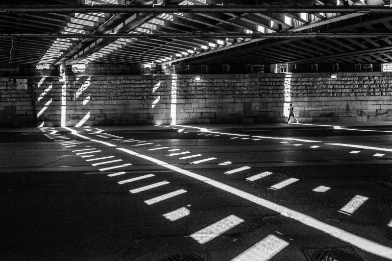
Photo by Matthew Henry on Unsplash

Photo by Zach Reiner on Unsplash
- Space
The way you arrange forms and shapes together occupies space within a frame. This arrangement is the composition and you can intentionally leave some empty space or negative space around and between other forms. This negative space can become an interesting compositional element as well. When you’re looking for a shot, you may consider not only the forms within the frame but also the space that isn’t occupied by these forms.

Photo by Nick Fewings on Unsplash
- Color
Color is comprised of three parts: hue, value, and intensity. The ‘hue’ is simply the name of the color (e.g. red, blue, green, etc). The ‘intensity’ refers to saturation (how bright and pure the color is), while the ‘value’ refers to luminosity (how bright or dark the color is).
There are color schemes that work well together. Remember to look at a color wheel from time to time, to know complementary color schemes, analogous colors.
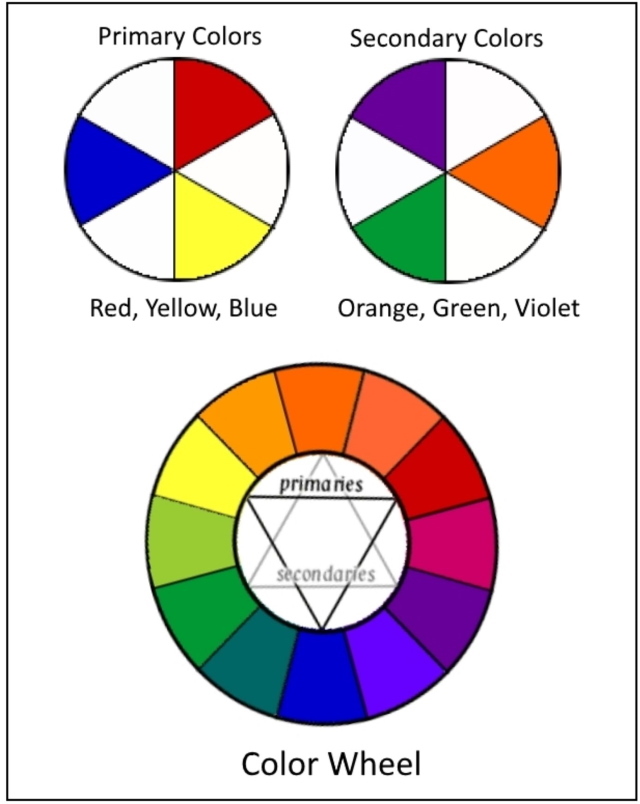
You may also check color.adobe.com you will find some great ways to check different color schemes. This app will also show you other colors that work well with a dominant color in your photograph.

Via color.adobe.com
- Symmetry
Many scenes are symmetrical in shapes like building and water reflections. When you have scenes that have the potential to be very symmetrically aligned, it’s important to make them line up. When the symmetry is off by just a little bit, it can make your composition look not right. If you cannot do this in the field, then giving yourself room to do it in post-processing can work just as well.
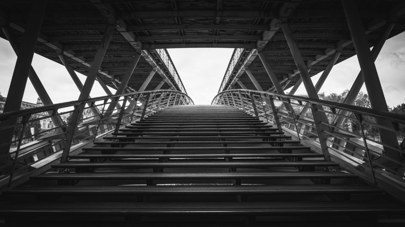
Photo by Pierre Blaché from Pexels
- Subject and background
Subject and background refer to the relationship between the main subject and everything else in the frame. In landscape photography, most photographers try to achieve full sharpness from the foreground to the background of an image. However, for portrait and wildlife photography the goal of the photographer is to put these subjects in a place where they clearly become the dominant part of an image and stand out from the background. The commonly used approach is blurring the background by using shallow depth of field or bokeh.

Photo by Warren Wong on Unsplash
Composition Techniques
After knowing the composition elements mentioned above, I think we can go through the different types of compositional techniques.
Composition rules
In photography, there are some rules and guidelines you can use to help improve the composition of your photos. These rules use ratios to divide the frame into the key areas by using lines and curves where your eye is naturally more likely to go. Many of them have been used in photography art for quite a long time and they really do help achieve compositions that are more attractive. The common composition rules are:
- The rule of thirds
- The Phi Grid (golden sections)
- The golden triangle
- The golden spiral (Fibonacci Spiral)
- Rule of symmetry (centered composition)
- color composition
- leading line composition
- Separation of the subject
- the diagonals rule
- Pattern rule
For full explanations of composition rules check the following two posts:
10 Rules For Photo Composition
Golden Ratio And Photography Composition
Example of the rule of third.

Photo by Ehab Amin
Lens type
The lens type can greatly change the perspective of the scene. Let us take a wide-angle as an example. We generally consider a lens to be “wide-angle” when its focal length is less than around 35 mm on a full-frame camera. This translates into an angle of view that is greater than about 55° across your photo’s widest dimension. For ultra-wide lens its focal lengths somewhere around 20 to 24 mm and less. With these types of lenses, Objects near the camera tend to appear larger, while objects in the distance appear extremely small.

Photo by Martin Alargent from Pexels
Telephoto lenses are lenses that have a focal length of 70 mm and more, it can reach 800 mm. The perspective compression of the telephoto lens makes elements look nearer to each other. Telephoto lenses are good at making the distances between far away and nearby elements look shorter. This is called the compression effect, and you can use it to reduce the sense of perspective in an image.
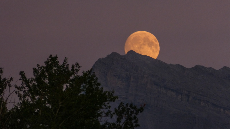
Photo by Kym MacKinnon on Unsplash
Selective Focus
Selective focus is a great way to have something pop up in your frame. It can be done by focusing only on your main subject and having the other objects blurry. The use of narrow depth of field can really help make a composition more interesting. This technique is used in wildlife and portrait photography.

Photo by Ehab Amin
Perspective
Looking for the perfect angle for your shot is very important with respect to composition. you need to see what other options are around. Changing the angle of your camera will get you a different perspective of the scene. The following are examples to show you different low and high camera angles. You may click here to get some compositional perspective ideas. The image below is shot from a high angle (top)
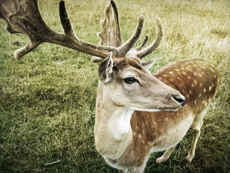
Photo by Silvio Kundt on Unsplash
And this image is shot from below (low-angle)
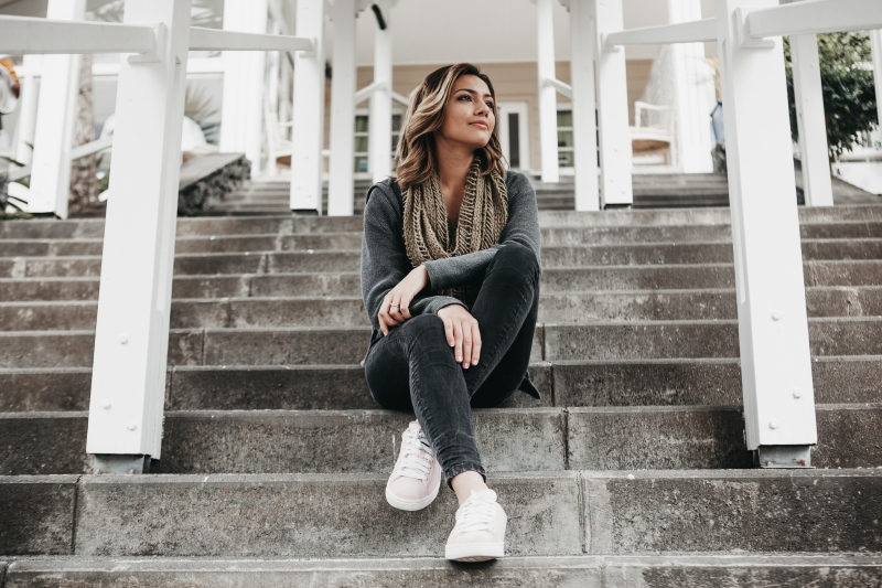
Photo by Candice Picard on Unsplash
The lighting effect
The main light direction with respect to your subject can produce a very different composition. For example, if you position your subject between your camera and the direct light (shooting against the light), a silhouette image can be made.

Photo by Jahangeer Bm from Pexels
Color
Another easy photography composition technique is the use of color to create stunning photographs and strengthen the message behind your images. You can choose to include one or several bold and striking colors to make your subjects stand out. Complementary colors (such as blue and orange sunsets) are also great for creating a stunning and well-balanced image. You may also want to play with color temperatures to produce interesting results.

Photo by Szelei Robert from Pexels
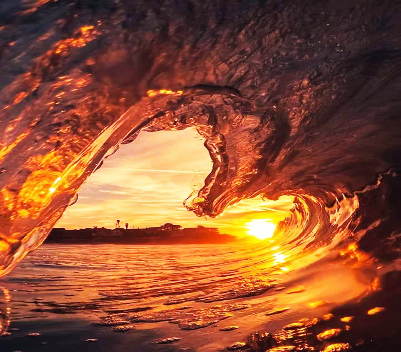
Photo by Hernan Pauccara from Pexels
Contrast
Contrast works in improving your composition, more so for monochromatic images. It can also be used to make your subject stand out by simply surround your subject and fill the frame with lighter colors. Monochromatic images like sepia and black-and-white also rely on contrast to reveal their details and textures.
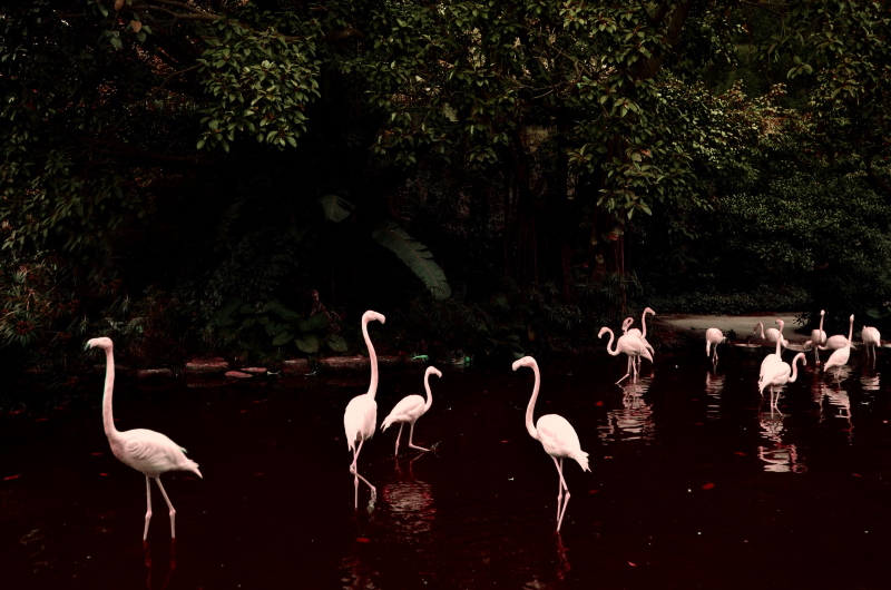
Photo by OLHA ZAIKA on Unsplash
Symmetrical Balance
Symmetry is a widely taught compositional technique used for creating visual balance in your photos. We unconsciously look for symmetry in all things. A photograph with elements that are almost perfectly balanced usually makes for a very appealing image. A scene of water reflection can be a good example of horizontal symmetry.
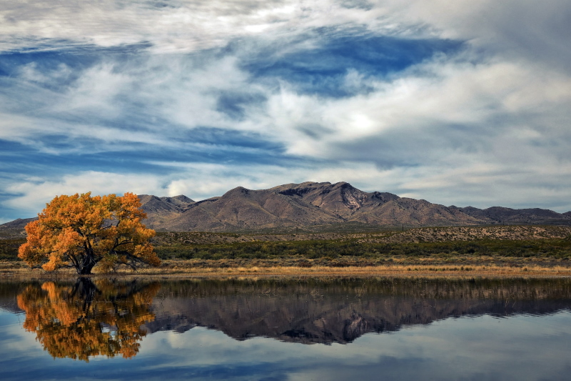
Photo by Robin Sommer on Unsplash
Natural Framing
Once you decide on your main subject, you may look for ways to frame that subject within the image. Maybe you can find some trees or bushes that you can shoot through them, and use as a natural frame. A hole in a wall or rock can also be used to make an interesting frame.
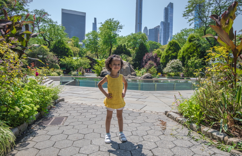
Photo by Ehab Amin
Conclusion
As important as it is to know how to follow and execute each composition technique, it is also important for you to listen to your creative instincts, which will sometimes tell you to break all the rules.
There really is no right or wrong way to compose an image, but there are better ways to do so.
Compositional techniques are great to help you start making more visually appealing images. The good thing is you can combine and use more than one compositional technique for an image. The more ways that you can draw a viewer’s eye into the image and keep it there, the better the image will be.
The important thing is to experiment with these techniques and keep practicing. Try them out as often as you can on different subject matter. Also, try to study as many photos as you can to find out what makes them better or worse. By doing this, not only will your images look better, but also your ability to see an image in a scene is improved.
Related posts
10 Rules For Photo Composition
Golden Ratio And Photography Composition
What Is Negative Space In Photography?
Rule Of Symmetry In Photography
Best Time To Take Landscape Photos- Golden And Blue Hour
Forced Perspective Photography Ideas
Perspective Photography Ideas – Your Ultimate Guide!
How To Shoot Silhouette Photos – 12 Tips To Get Perfect Results
What Are The Different Types Of Light In Photography?
Top 10 Photography Rules – Guidelines For Better Photos
Thanks for reading, I hope you enjoyed the article, in case you have any questions just drop them below & I will be happy to answer you.
If you enjoy the site, don’t forget to subscribe, we will only inform you when a new article is posted.





Thank you for briefly giving us a glimpse of all these elements. Composition can make a huge difference in our results. It requires planning and knowing what we’re going for. But the pictures speak better and clearer when all these elements are taken into consideration. I’ll start practicing right away.
Thank you Ann for your comment, yes you are right, it is all about practicing. Good luck
I am a (very) amateur photographer so I read this article with an eagerness to learn. I love the basics you have put forth here as to how to draw a viewer into a photograph. I found the value and space definitions especially intriguing as I’m especially drawn to simple and/or black/white photos. I hope to use this newfound knowledge to improve my own pictures! Thank you for posting!
Thanks for your feedback!