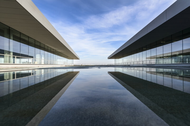
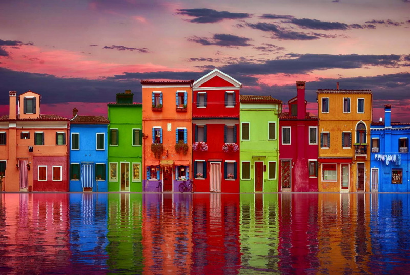
Balancing elements in photography is achieved when the elements in your photo are arranged in a way that feels natural and pleasing to the eye. A well-balanced composition feels harmonious while an unbalanced one can feel “off” and less engaging.
In other words, balance is a composition technique that arranges elements within the frame to achieve equal visual weight across the image. The visual weight of an element measures how much attraction it draws from the viewer, and it is influenced by a number of factors, including contrast, color, size, placement, and texture.
Balancing and visual weights
Generally, our eyes will go first to the focal point of a viewed photo. Can you guess where does your eye go next? Well In an interesting composition, there is generally a hierarchy of interesting elements for your eye to be attracted to, the order in which you see them describes how much “Visual Weight” those elements have.
In photography, Visual Weight is a compositional tool used to guide your eye to the focal point. It is affected by many factors, such as placement of the main subject, subject size, contrast, color, tone, texture, and brightness.
Balance in photography is observed when an image has subject areas that look balanced throughout the composition. For a balanced picture, you need to position these elements so that no one part of the image has too much “weight” compared to other parts.
It is achieved by shifting the frame and juxtaposing subjects within it so objects, tones, and colors are of equal visual weight. An image is balanced when subject areas command a viewer’s attention equally.
As with anything in art, a composition does not have to be balanced, but it’s a good idea to understand what this means so you can make a conscious decision whether to use a balanced or an unbalanced composition.
How to achieve balance?
Below you’ll find some types of balance in photography to help you create more visually appealing and meaningful photographs:
-
Symmetrical balance (formal balance)
Perhaps symmetrical balance is the simplest and most obvious way to compose your photo. Simply arrange the elements of your picture so that they’re symmetrical around the center.
There are three types of symmetrical balance:
-
Vertical Symmetry
Architecture images are some of the most obvious examples because there are so many clean lines to follow that it becomes obvious. However, vertical symmetry can also be extended to nature and people photography as well!

Photo by Pixabay
-
Horizontal Symmetry
Horizontal symmetry seeks balance on the opposite dimension as vertical symmetry. Reflections are one of the most obvious uses of horizontal symmetry. The horizontal mirror image just begs to be balanced in terms of a perfectly straight horizontal line and enough space in the frame to show the reflection properly.

Photo by eberhard grossgasteiger from Pexels
-
Radial Symmetry
Radial symmetry is the third most common form of symmetry we encounter in photography. The mind is pleased by natural order and the circular patterns found in splashes of water, the human iris, and flower petals, star trails, and sunsets are captivating.

Photo by Yaowaluck Promdee from Pexels

Photo by Ehab Amin
-
Asymmetrical Balance (informal balance)
It requires intentionally placing your subject off-center, it is more difficult to achieve but gets easier with daily practice. The rule of thirds uses asymmetry to your advantage. This technique suggests that the most interesting location for an image’s focal point lies one-third in from either edge of the frame and one-third down from the top or up from the bottom. The best place for the focal point when using asymmetrical balance is at the intersection of any two lines.

Photo by Ehab Amin
Another way to use asymmetry to create balance in photography composition is by balancing out your main subject with another, a less important subject that contrasts with the former in terms of size, color, or general appearance.
For example, in the below photo, the main subject (the old building) is placed far to the right, and a secondary subject (the tree) is placed off-center toward the left edge of the frame, they complement each other by varying in size, thus creating balance in both size and subject placement.

Photo by Kevin Rojas from Pexels
-
Color balance
Color balance is the global adjustment of the intensities of the colors. An important goal of this adjustment is to render specific colors (particularly neutral colors) correctly; hence, the general method is called gray balance, neutral balance, or white balance. Color balance changes the overall mixture of colors in an image and is used for color correction; generalized versions of color balance are used to get colors other than neutrals to also appear correct or pleasing.
Certain colors have more visual weight than others do. If you have a series of objects in a line and one of them is red while the rest are yellow, the red one has the heavier visual weight. Areas of contrasting or complementary colors also create tension and balance depending on where they are placed within the frame.
In post-processing editing, Photoshop has a tool called Color balance that can be used to correct color imperfections in your image. You can also use color balance to create dramatic effects by changing the overall mixture of colors used in your composite. Photo Filter is another option that lets you apply a hue adjustment to your image. Photo Filter adjustments mimic the technique of placing a colored filter in front of your camera lens to adjust the color balance and temperature of the light transmitted through the lens and exposing the film.
-
Tonal Balance
Tone refers to the levels of brightness in the photograph, from solid black to pure white. Shadows are dark tones; highlights are bright tones. The majority of nature photographs display a wide range of tones, from black or near black to white or near white.
A photograph with mostly dark tones is called low key and feels heavy and dramatic. A photo with mostly light tones is called high key and feels bright and airy.
Evaluating and controlling the tones in your composition is a key skill in designing effective photographs. Our eyes are naturally drawn to the area of highest contrast in an image. This could mean the lightest area and the darkest area of the scene.
If your image is lacking interest, adding artificial lighting can dramatically change the scene. For more information on using lighting techniques to create contrast in your images, click here.

Photo by Ehab Amin
Tonal balance is best observed in monochromatic or black-and-white images where different tones are easily distinguishable. In this case, tonal balance is seen in terms of the contrast between lighter and darker areas within an image. A small area of white in a photo can be balanced by a larger area of black, and vice versus. Each one does not have to have the same intensity.

Photo by Tyler Lastovich from Pexels
-
Texture Balance
Patterns and textures are visually interesting and therefore become natural points of interest. Strong textures in supporting areas of your photo will help balance an off-center subject but beware of textured backgrounds that detract from the main focal point.
In the below photo, the texture of the water and the rocks gives them extra visual weight, helping to counterbalance the strong imagery of the clouds in the sky.

Photo by stein egil liland from Pexels
-
Negative Space
A large area of negative space can balance out smaller objects on one side. The negative space essentially acts as a large shape. In the example below, negative space and contrast are working together to draw your eye to the focal point.

Conclusion
If you are conscientious with your compositions, you will be able to control the degree of balance in most scenes. Moreover, if you find a scene that cannot be balanced effectively, you generally can use post-processing to add some contrast, highlight certain areas, crop your photo, or make color adjustments, etc.
You have to think about the type of image you want, and then consider how balance or imbalance can help you achieve your goal.
Related posts
Rule of Symmetry in Photography
Top 10 Photography Rules – Guidelines For Better Photos
Water Reflections Photography – A Brief Guide
Golden Ratio And Photography Composition
10 Rules for Photo Composition
Thanks for reading, I hope you enjoyed the article, in case you have any questions just drop them below & I will be happy to answer you.
The featured Image by jplenio from Pixabay
If you enjoy the site, don’t forget to subscribe, we will only inform you when a new article is posted.


Balancing the photo, wow, I have read several of your articles and you really give out helpful information.
And as usual i like the visuals, the pictures are so on point and you are so elaborate in the article. How can we have photography class to guide the beginners especially on their journey.
Thanks for the comment, the answer to your question is definitely reading photography tutorials, and watching videos online. The internet has tons of learning resources. I recommend reading my post “Learn Digital Photography Online“
Beautiful website Amin! I really enjoyed your articles and the layout of your website! Being able to change the photos from black to white and adjusting the color contrast with the slider is a nice touch! I’m going to bookmark your site so I can share it with an aspiring photographer I know! Hopefully it will help with her skills! Thank you!
Many thanks, I really appreciate your comment.